This is the multi-page printable view of this section. Click here to print.
Content and Customization
1 - Adding Content
So you’ve got a new Hugo website with Docsy, now it’s time to add some content! This page tells you how to use the theme to add and structure your site content.
Content root directory
You add content for your site under the content root directory of your Hugo
site project - either content/ or a language-specific root
like content/en/. The main exception here is static files that you don’t want
built into your site: you can find out more about where you add these below in
Adding static content. The files in your content root
directory are typically grouped in subdirectories corresponding to your site’s
sections and templates, which we’ll look at in
Content sections and templates.
You can find out more about Hugo directory structure in Directory Structure Explained.
Content sections and templates
Hugo builds your site pages using the content files you provide plus any templates provided by your site’s theme. These templates (or “layouts” in Hugo terminology) include things like your page’s headers, footers, navigation, and links to stylesheets: essentially, everything except your page’s specific content. The templates in turn can be made up of partials: little reusable snippets of HTML for page elements like headers, search boxes, and more.
Because most technical documentation sites have different sections for different types of content, the Docsy theme comes with the following templates for top-level site sections that you might need:
docsis for pages in your site’s Documentation section.blogis for pages in your site’s Blog.communityis for your site’s Community page.
It also provides a default “landing page” type of template with the site header and footer, but no left nav, that you can use for any other section. In this site and our example site it’s used for the site home page and the About page.
Each top-level section in your site corresponds to a directory in your
site content root. Hugo automatically applies the appropriate template for
that section, depending on which folder the content is in. For example, this
page is in the docs subdirectory of the site’s content root directory
content/en/, so Hugo automatically applies the docs template. You can
override this by explicitly specifying a template or content type for a
particular page.
If you’ve copied the example site, you already have appropriately named
top-level section directories for using Docsy’s templates, each with an index
page ( _index.md or index.html) page for users to land on. These top-level
sections also appear in the example site’s
top-level menu.
Custom sections
If you’ve copied the example site and don’t want to use one of the provided
content sections, just delete the appropriate content subdirectory. Similarly,
if you want to add a top-level section, just add a new subdirectory, though
you’ll need to specify the layout or content type explicitly in the
frontmatter of each page if you want to use any existing
Docsy template other than the default one. For example, if you create a new
directory content/en/amazing and want one or more pages in that custom section
to use Docsy’s docs template, you add type: docs to the frontmatter of each
page:
+++
title = "My amazing new section"
weight = 1
type = "docs"
description = '''
A special section with a docs layout.
'''
+++
---
title: "My amazing new section"
weight: 1
type: docs
description: >
A special section with a docs layout.
---{
"title": "My amazing new section",
"weight": 1,
"type": "docs",
"description": "A special section with a docs layout.\n"
}Alternatively, create your own page template for your new section in your
project’s layouts directory based on one of the existing templates.
You can find out much more about how Hugo page layouts work in Hugo Templates. The rest of this page tells you about how to add content and use each of Docsy’s templates.
Alternative site structure
As noted above, by default your site has a home page, a docs section under
/docs/, a blog section under /blog/ and a community section under
/community/. The type of each
section (which determines the layout it uses) matches its directory name.
In some cases, you may want to have a different directory structure, but still
make use of Docsy’s layouts. A common example is for a “docs site”, where most
of the pages (including the home page) use the docs layout, or perhaps you’d
rather have a /news/ directory treated with the blog layout.
Since Hugo 0.76, this has become practical without copying layouts to your site,
or having to specify type: blog on every single page by making use of
target specific cascading front matter.
For example, for the /news/ section, you can specify the following front
matter in the index page which will change the type of the section and
everything below it to “blog”:
+++
title = "Latest News"
linkTitle = "News"

[menu.main]
weight = 30

[[cascade]]
type = "blog"
+++
---
title: "Latest News"
linkTitle: "News"
menu:
main:
weight: 30
cascade:
- type: "blog"
---{
"title": "Latest News",
"linkTitle": "News",
"menu": {
"main": {
"weight": 30
}
},
"cascade": [
{
"type": "blog"
}
]
}If you want to create a “docs” site, specifying something like the following in
the top level _index.md will set all top level sections to be treated as
“docs”, except for “news”:
+++
title = "My Wonderful Site"

[[cascade]]
type = "blog"
toc_root = true

  [cascade._target]
  path = "/news/**"

[[cascade]]
type = "docs"

  [cascade._target]
  path = "/**"
+++
---
title: "My Wonderful Site"
cascade:
- type: "blog"
toc_root: true
_target:
path: "/news/**"
- type: "docs"
_target:
path: "/**"
---{
"title": "My Wonderful Site",
"cascade": [
{
"type": "blog",
"toc_root": true,
"_target": {
"path": "/news/**"
}
},
{
"type": "docs",
"_target": {
"path": "/**"
}
}
]
}Note the addition of toc_root here. Setting that to true for a section causes
it to be treated as a separate part of the site, with its own left hand
navigation menu.
An example docs-based site that uses this technique can be found at the mostly docs repo.
Page frontmatter
Each page file in a Hugo site has metadata frontmatter that tells Hugo about the page. You specify page frontmatter in TOML, YAML, or JSON (our example site and this site use YAML). Use the frontmatter to specify the page title, description, creation date, link title, template, menu weighting, and even any resources such as images used by the page. You can see a complete list of possible page frontmatter in Front Matter.
For example, here’s the frontmatter for this page:
+++
title = "Adding Content"
linkTitle = "Adding Content"
weight = 1
description = '''
Add different types of content to your Docsy site.
'''
+++
---
title: "Adding Content"
linkTitle: "Adding Content"
weight: 1
description: >
Add different types of content to your Docsy site.
---{
"title": "Adding Content",
"linkTitle": "Adding Content",
"weight": 1,
"description": "Add different types of content to your Docsy site.\n"
}The minimum frontmatter you need to provide is a title: everything else is up to
you! However, if you leave out the page weight, your
navigation may get a little disorganized. You
may also want to include description since Docsy uses that to generate the
meta description tag used by search engines. See Search Engine Optimization
(SEO) meta tags
for details.
Page contents and markup
By default you create pages in a Docsy site as simple Markdown or HTML files with page frontmatter, as described above. As of version 0.100, Goldmark is the only Markdown parser supported by Hugo.
If you’ve been using versions of Hugo before 0.60 that use
BlackFriday as its Markdown parser,
you may need to make some small changes to your site to work with the current
Goldmark Markdown parser. In particular, if you cloned an earlier version of
our example site, add the following to your hugo.toml/hugo.yaml/hugo.json
to allow Goldmark to render raw HTML as well as Markdown:
[markup]
  [markup.goldmark]
    [markup.goldmark.renderer]
unsafe = truemarkup:
goldmark:
renderer:
unsafe: true{
"markup": {
"goldmark": {
"renderer": {
"unsafe": true
}
}
}
}In addition to your marked-up text, you can also use Hugo and Docsy’s shortcodes: reusable chunks of HTML that you can use to quickly build your pages. Find out more about shortcodes in Docsy Shortcodes.
Hugo also supports adding content using
other markups using
external parsers as helpers.
For example, you can add content in RST using rst2html as an external parser
(though be aware this does not support all flavors of RST, such as Sphinx RST).
Similarly, you can use asciidoctor to parse Asciidoc files, or pandoc for
other formats.
External parsers may not be suitable for use with all deployment options, as you’ll need to install the external parser and run Hugo yourself to generate your site (so, for example, you won’t be able to use Netlify’s continuous deployment feature). In addition, adding an external parser may cause performance issues building larger sites.
Working with links
Hugo lets you specify links using normal Markdown syntax, though remember that you need to specify links relative to your site’s root URL, and that relative URLs are left unchanged by Hugo in your site’s generated HTML.
Alternatively you can use Hugo’s helper
ref and relref shortcodes for
creating internal links that resolve to the correct URL. However, be aware this
means your links will not appear as links at all if a user views your page
outside your generated site, for example using the rendered Markdown feature in
GitHub’s web UI.
You can find (or add!) tips and gotchas for working with Hugo links in Hugo Tips.
Content style
We don’t mandate any particular style for your page contents. However, if you’d like some guidance on how to write and format clear, concise technical documentation, we recommend the Google Developer Documentation Style Guide, particularly the Style Guide Highlights.
Page bundles
You can create site pages as standalone files in their section or subsection directory, or as folders where the content is in the folder’s index page. Creating a folder for your page lets you bundle images and other resources together with the content.
You can see examples of both approaches in this and our example site. For
example, the source for this page is just a standalone file
/content/en/docs/adding-content.md. However the source for
Docsy Shortcodes in this site lives in
/content/en/docs/adding-content/shortcodes/index.md, with the image resource
used by the page in the same /shortcodes/ directory. In Hugo terminology, this
is called a leaf bundle because it’s a folder containing all the data for a
single site page without any child pages (and uses index.md without an
underscore).
You can find out much more about managing resources with Hugo bundles in Page Bundles.
Adding docs and blog posts
The template you’ll probably use most often is the
docs template
(as used in this page) or the very similar
blog template.
Both these templates include:
- a left nav
- GitHub links (populated from your site config) for readers to edit the page or create issues
- a page menu
as well as the common header and footer used by all your site’s pages. Which
template is applied depends on whether you’ve added the content to the blog or
docs content directory. You can find out more about how the nav and page menu
are created in Navigation and Search.
Organizing your documentation
While Docsy’s top-level sections let you create site sections for different
types of content, you may also want to organize your docs content within your
docs section. For example, this site’s docs section directory has multiple
subdirectories for Getting Started, Content and Customization, and so
on. Each subdirectory has an _index.md (it could also be an _index.html),
which acts as a section index page and tells Hugo that the relevant directory is
a subsection of your docs.
Docsy’s docs layout gives you a left nav pane with an autogenerated nested
menu based on your docs file structure. Each standalone page or subsection
_index.md or _index.html page in the docs/ directory gets a top level menu
item, using the link name and weight metadata from the page or index.
To add docs to a subsection, just add your page files to the relevant
subdirectory. Any pages that you add to a subsection in addition to the
subsection index page will appear in a submenu (look to the left to see one in
action!), again ordered by page weight. Find out more about adding Docsy’s
navigation metadata in Navigation and Search
If you’ve copied the example site, you’ll already have some suggested
subdirectories in your docs directory, with guidance for what types of content
to put in them and some example Markdown pages. You can find out more about
organizing your content with Docsy in
Organizing Your Content.
Docs section landing pages
By default a docs section landing page (the _index.md or _index.html in the
section directory) uses a layout that adds a formatted list of links to the
pages in the section, with their frontmatter descriptions. The
Content and Customization landing page in this site is
a good example.
To display a simple bulleted list of links to the section’s pages instead,
specify simple_list: true in the landing page’s frontmatter:
+++
title = "Simple List Page"
simple_list = true
weight = 20
+++
---
title: "Simple List Page"
simple_list: true
weight: 20
---{
"title": "Simple List Page",
"simple_list": true,
"weight": 20
}To display no links at all, specify no_list: true in the landing page’s
frontmatter:
+++
title = "No List Page"
no_list = true
weight = 20
+++
---
title: "No List Page"
no_list: true
weight: 20
---{
"title": "No List Page",
"no_list": true,
"weight": 20
}Organizing your blog posts
Docsy’s blog layout also gives you a left nav menu (like the docs layout),
and a list-type index page for your blog that’s applied to /blog/_index.md and
automatically displays snippets of all your recent posts in reverse
chronological order.
To create different blog categories to organize your posts, create subfolders in
blog/. For instance, in our
example site
we have news and releases. Each category needs to have its own _index.md
or _index.html landing page file specifying the category title for it to
appear properly in the left nav and top-level blog landing page. Here’s the
index page for releases:
+++
title = "New Releases"
linkTitle = "Releases"
weight = 20
+++
---
title: "New Releases"
linkTitle: "Releases"
weight: 20
---{
"title": "New Releases",
"linkTitle": "Releases",
"weight": 20
}To add author and date information to blog posts, add them to the page frontmatter:
+++
date = 2018-10-06T00:00:00.000Z
title = "Easy documentation with Docsy"
linkTitle = "Announcing Docsy"
description = "The Docsy Hugo theme lets project maintainers and contributors focus on content, not on reinventing a website infrastructure from scratch"
author = "Riona MacNamara"

[[resources]]
src = "**.{png,jpg}"
title = "Image #:counter"

  [resources.params]
  byline = "Photo: Riona MacNamara / CC-BY-CA"
+++
---
date: 2018-10-06
title: "Easy documentation with Docsy"
linkTitle: "Announcing Docsy"
description: "The Docsy Hugo theme lets project maintainers and contributors focus on content, not on reinventing a website infrastructure from scratch"
author: Riona MacNamara
resources:
- src: "**.{png,jpg}"
title: "Image #:counter"
params:
byline: "Photo: Riona MacNamara / CC-BY-CA"
---{
"date": "2018-10-06T00:00:00.000Z",
"title": "Easy documentation with Docsy",
"linkTitle": "Announcing Docsy",
"description": "The Docsy Hugo theme lets project maintainers and contributors focus on content, not on reinventing a website infrastructure from scratch",
"author": "Riona MacNamara",
"resources": [
{
"src": "**.{png,jpg}",
"title": "Image #:counter",
"params": {
"byline": "Photo: Riona MacNamara / CC-BY-CA"
}
}
]
}If you’ve copied the example site and you don’t want a blog section, or want to
link to an external blog instead, just delete the blog subdirectory.
Working with top-level landing pages.
Docsy’s default page template has no left nav and is useful for creating a home page for your site or other “landing” type pages.
Customizing the example site pages
If you’ve copied the example site, you already have a simple site landing page
in content/en/_index.html. This is made up of Docsy’s provided Hugo shortcode
page blocks.
To customize the large landing image, which is in a
cover block, replace the
content/en/featured-background.jpg file in your project with your own image
(it can be called whatever you like as long as it has background in the file
name). You can remove or add as many blocks as you like, as well as adding your
own custom content.
The example site also has an About page in content/en/about/_index.html using
the same Docsy template. Again, this is made up of
page blocks, including
another background image in content/en/about/featured-background.jpg. As with
the site landing page, you can replace the image, remove or add blocks, or just
add your own content.
Building your own landing pages
If you’ve just used the theme, you can still use all Docsy’s provided page blocks (or any other content you want) to build your own landing pages in the same file locations.
Adding a community page
The community landing page template has boilerplate content that’s
automatically filled in with the project name and community links specified in
hugo.toml/hugo.yaml/hugo.json, providing your users with quick links to
resources that help them get involved in your project. The same links are also
added by default to your site footer.
[params.links]
# End user relevant links. These will show up on left side of footer and in the community page if you have one.
[[params.links.user]]
	name = "User mailing list"
	url = "https://example.org/mail"
	icon = "fa fa-envelope"
        desc = "Discussion and help from your fellow users"
[[params.links.user]]
	name ="Twitter"
	url = "https://example.org/twitter"
	icon = "fab fa-x-twitter"
        desc = "Follow us on Twitter to get the latest news!"
[[params.links.user]]
	name = "Stack Overflow"
	url = "https://example.org/stack"
	icon = "fab fa-stack-overflow"
        desc = "Practical questions and curated answers"
# Developer relevant links. These will show up on right side of footer and in the community page if you have one.
[[params.links.developer]]
	name = "GitHub"
	url = "https://github.com/google/docsy"
	icon = "fab fa-github"
        desc = "Development takes place here!"
[[params.links.developer]]
	name = "Slack"
	url = "https://example.org/slack"
	icon = "fab fa-slack"
        desc = "Chat with other project developers"
[[params.links.developer]]
	name = "Developer mailing list"
	url = "https://example.org/mail"
	icon = "fa fa-envelope"
desc = "Discuss development issues around the project"params:
links:
user:
- name: User mailing list
url: 'https://example.org/mail'
icon: fa fa-envelope
desc: Discussion and help from your fellow users
- name: Twitter
url: 'https://example.org/twitter'
icon: fab fa-x-twitter
desc: Follow us on Twitter to get the latest news!
- name: Stack Overflow
url: 'https://example.org/stack'
icon: fab fa-stack-overflow
desc: Practical questions and curated answers
developer:
- name: GitHub
url: 'https://github.com/google/docsy'
icon: fab fa-github
desc: Development takes place here!
- name: Slack
url: 'https://example.org/slack'
icon: fab fa-slack
desc: Chat with other project developers
- name: Developer mailing list
url: 'https://example.org/mail'
icon: fa fa-envelope
desc: Discuss development issues around the project{
"params": {
"links": {
"user": [
{
"name": "User mailing list",
"url": "https://example.org/mail",
"icon": "fa fa-envelope",
"desc": "Discussion and help from your fellow users"
},
{
"name": "Twitter",
"url": "https://example.org/twitter",
"icon": "fa-brands fa-x-twitter",
"desc": "Follow us on Twitter to get the latest news!"
},
{
"name": "Stack Overflow",
"url": "https://example.org/stack",
"icon": "fa-brands fa-stack-overflow",
"desc": "Practical questions and curated answers"
}
],
"developer": [
{
"name": "GitHub",
"url": "https://github.com/google/docsy",
"icon": "fa-brands fa-github",
"desc": "Development takes place here!"
},
{
"name": "Slack",
"url": "https://example.org/slack",
"icon": "fa-brands fa-slack",
"desc": "Chat with other project developers"
},
{
"name": "Developer mailing list",
"url": "https://example.org/mail",
"icon": "fa fa-envelope",
"desc": "Discuss development issues around the project"
}
]
}
}
}If you’re creating your own site and want to add a page using this template, add
a /community/_index.md file in your content root directory. If you’ve copied
the example site and don’t want a community page, just delete the
/content/en/community/ directory in your project repo.
By default, Docsy layouts assume that your project’s contributing page is found
at <baseURL>/docs/contribution-guidelines. To specify another URL, add it to
the front matter of /community/_index.md as illustrated next. The URL can be
an external URL or a local path:
params:
  contributingUrl: docs/contributing/
Adding static content
You may want to serve some non-Hugo-built content along with your site: for example, if you have generated reference docs using Doxygen, Javadoc, or other doc generation tools.
To add static content to be served “as-is”, just add the content as a folder
and/or files in your site’s static directory. When your site is deployed,
content in this directory is served at the site root path. So, for example, if
you have added content at /static/reference/cpp/, users can access that
content at http://{server-url}/reference/cpp/ and you can link to pages in
this directory from other pages at /reference/cpp/{file name}.
You can also use this directory for other files used by your project, including image files. You can find out more about serving static files, including configuring multiple directories for static content.
RSS feeds
Hugo will, by default, create an RSS feed for the home page and any section. To
disable all RSS feeds, add the following to your
hugo.toml/hugo.yaml/hugo.json:
disableKinds = ["RSS"]disableKinds: [RSS]{
"disableKinds": [
"RSS"
]
}If you have enabled our print feature or
otherwise specified section-level output formats in
hugo.toml/hugo.yaml/hugo.json, make sure that "RSS" is listed as an
output format, otherwise you won’t get section-level RSS feeds (and your blog
section won’t get a nice orange RSS button). Your
hugo.toml/hugo.yaml/hugo.json specification overrides the Hugo default
output formats for sections,
which are HTML and RSS.
[outputs]
section = [ "HTML", "RSS", "print" ]outputs:
section:
- HTML
- RSS
- print{
"outputs": {
"section": [
"HTML",
"RSS",
"print"
]
}
}Sitemap
Hugo creates a sitemap.xml file for your generated site by default: for
example, here’s the sitemap for this site.
You can configure the frequency with which your sitemap is updated, your sitemap
filename, and the default page priority in your
hugo.toml/hugo.yaml/hugo.json:
[sitemap]
  changefreq = "monthly"
  filename = "sitemap.xml"
priority = 0.5sitemap:
changefreq: monthly
filename: sitemap.xml
priority: 0.5{
"sitemap": {
"changefreq": "monthly",
"filename": "sitemap.xml",
"priority": 0.5
}
}To override any of these values for a given page, specify it in page frontmatter:
+++
title = "Adding Content"
linkTitle = "Adding Content"
weight = 1
description = '''
Add different types of content to your Docsy site.
'''
[sitemap]
priority = 1
+++
---
title: "Adding Content"
linkTitle: "Adding Content"
weight: 1
description: >
Add different types of content to your Docsy site.
sitemap:
priority: 1.0
---{
"title": "Adding Content",
"linkTitle": "Adding Content",
"weight": 1,
"description": "Add different types of content to your Docsy site.\n",
"sitemap": {
"priority": 1
}
}To learn more about configuring sitemaps, see Sitemap Template.
2 - Look and Feel
By default, a site using Docsy has the theme’s default fonts, colors, and general look and feel. However, if you want your own color scheme (and you probably will!) you can very easily override the theme defaults with your own project-specific values - Hugo will look in your project files first when looking for information to build your site. And because Docsy uses Bootstrap 5 and SCSS for styling, you can override just single values (such as project colors and fonts) in its special SCSS project variables file, or do more serious customization by creating your own styles.
Docsy also provides options for styling your code blocks, using either Chroma or Prism for highlighting.
Project style files
To customize your project’s look and feel, create your own version of the
following Docsy placeholder files (note the _project*.scss suffixes) and
place them inside your project’s assets/scss/ folder:
_variables_project.scssand_variables_project_after_bs.scss:Use these files to add project-specific definitions of theme variables as well as any additional Bootstrap variables you want to set or override. For details, including an explanation of which file to use, see Site colors.
For a list of Docsy’s theme variables and their default values, see
_variables.scss. For information about other Bootstrap 5 variables, see Variable defaults and Bootstrap’s_variables.scssfile._styles_project.scssis where you can add your own custom SCSS styles, including overriding any of the styles in Docsy’s theme SCSS files.
PostCSS (autoprefixing of CSS browser-prefixes) is not enabled when running in server mode (it is a little slow), so Chrome is the recommended choice for development.
Colors and color themes
Docsy defaults to Bootstrap’s standard color scheme. This section explains how to customize your site’s colors and how to enable light/dark color themes.
Site colors
To customize your site’s colors, add SCSS variable overrides to
assets/scss/_variables_project.scss. For example, you can set the primary
and secondary site colors as follows:
$primary: #390040;
$secondary: #a23b72;
Docsy has Bootstrap features such as gradient backgrounds
($enable-gradients) and shadows ($enable-shadows) enabled by default. These
can also be toggled in your project variables file by setting the variables to
false.
To add colors to or modify Bootstrap’s color maps, use
assets/scss/_variables_project_after_bs.scss. For example:
$custom-colors: (
  'my-favorite-color': purple,
  'my-other-color': pink,
);

$theme-colors: map-merge($theme-colors, $custom-colors);
To learn how to modify maps, see Maps and loops and Adding theme colors.
Light/dark color themes
Docsy 0.10.0 supports light and dark mode color themes. To allow your website users to choose light/dark modes, enable the Docsy light/dark menu or create your own custom theme selector.
If your site uses Chroma for code highlighting, there are extra steps required so that code-block styles are compatible with light/dark mode:
- Ensure that
markup.highlight.noClassesisfalsein your project config. For details about this option, see Generate syntax highlighter CSS. - Add
@import 'td/code-dark'to your project’s_styles_project.scssfile.
For details, see Chroma for code highlighting.
Light/dark color themes, only affect documentation pages, and white blocks shortcodes.
Fonts
By default, Docsy uses Bootstrap’s native font stack for its typography.
However, Docsy also supports Google Fonts. To enable Google Fonts and use Open
Sans as your project’s primary font, add the following variable to
assets/scss/_variables_project.scss:
$td-enable-google-fonts: true;
To configure another Google Font:
$td-google-font-name: 'Roboto';
$td-google-font-family: 'Roboto:300,300i,400,400i,700,700i';
CSS utilities
For documentation of available CSS utility classes, see the Bootstrap documentation. This theme adds very little on its own in this area. However, we have added some color state CSS classes that can be useful in a dynamic context:
.-bg-<color>.-text-<color>
You can use these classes, for example, to style your text in an appropriate
color when you don’t know if the primary color is dark or light, to ensure
proper color contrast. They are also useful when you receive the color code as a
shortcode parameter.
The value of <color> can be any of the color names, primary, white,
dark, warning, light, success, 300, blue, orange etc.
When you use .-bg-<color>, the text colors will be adjusted to get proper
contrast:
<div class="-bg-primary p-3 display-6">Background: Primary</div>
<div class="-bg-200 p-3 display-6">Background: Gray 200</div>
To only set the text color use .-text-<color>:
<div class="-text-blue pt-3 display-6">Text: Blue</div>
Code highlighting with Chroma
As of Hugo 0.60+, you can choose from a range of code block highlight and color styles using Chroma. These styles are applied to your fenced code blocks. For details about code highlighting in Hugo using Chroma, see Syntax Highlighting.
Chroma style configuration
Hugo’s default Chroma style is monokai. To use another style, such as tango, add the following to your project configuration:
[markup]
  [markup.highlight]
style = "tango"markup:
highlight:
style: tango{
"markup": {
"highlight": {
"style": "tango"
}
}
}For the complete list of available styles, see Chroma Style Gallery.
Light/dark code styles
Docsy’s default Chroma styles for light/dark mode are:
If you would like to use other styles, save the Hugo generated Chroma styles to the appropriate file:
Code blocks without a specified language
By default, highlighting is not applied to code blocks without a specified
language. If you would like code highlighting to apply to all code blocks,
even without a language, set markup.highlight.guessSyntax to true in your
project’s configuration file.
Copy to clipboard
If you are using a Docsy 0.6.0 or later, code blocks show a “Copy to clipboard”
button in the top right-hand corner. To disable this functionality, set
disable_click2copy_chroma to true in your configuration file.
Code highlighting with Prism
Optionally, you can enable Prism syntax highlighting in your
hugo.toml/hugo.yaml/hugo.json:
[params]
prism_syntax_highlighting = trueparams:
prism_syntax_highlighting: true{
"params": {
"prism_syntax_highlighting": true
}
}When this option is enabled your site uses Prism instead of Chroma for code block highlighting.
Prism is a popular open source syntax highlighter which supports over 200 languages and various plugins.
Docsy includes JavaScript and CSS files for a basic Prism configuration, which supports:
- Code blocks styled with the Prism
Defaulttheme - Copy to clipboard buttons on code blocks
- Syntax highlighting for a number of common languages, as specified in the following Prism download link, Customize your download.
Code blocks with no language
By default, Prism code highlighting styles are not applied to code blocks
without a specified language, instead you get Docsy’s default style of grey with
black text. To apply Prism styling to code blocks with no language or a language
not supported by Prism, specify none as the language after your triple
backticks.
Extending Prism for additional languages or plugins
If the included Prism configuration is not sufficient for your requirements, and you want to use additional languages or plugins you can replace the included files with your own.
- Download your own Prism JS and CSS files from https://prismjs.com/download.html
- Replace the included Prism JS and CSS with the files you downloaded:
- Copy the Javascript file to
static/js/prism.js - Copy the CSS file to
static/css/prism.css
- Copy the Javascript file to
Navbar
Styling your project logo and name
The default Docsy navbar (.td-navbar) displays your site identity, consisting
of the following:
Your logo, which is included in the navbar as an inline SVG, styled by
.td-navbar .navbar-brand svg. For the style details, see _nav.scss.To ensure your logo displays correctly, you may want to resize it and ensure that it doesn’t have height and width attributes so that its size is fully responsive. Override the default styling of
.td-navbar .navbar-brand svgor (equivalently).td-navbar .navbar-brand__logoas needed.Your project name, which is the site
title. If you don’t want your project name to appear (for example, because your logo is or contains a wordmark), then add the following custom styling to your project’s styles:.td-navbar .navbar-brand__name { display: none; }
Light/dark mode menu
If you enable this feature, Docsy adds a menu to your navbar that lets users switch your site’s documentation page display between a default “light” mode, and a “dark” mode where the text is displayed in a light color on a dark background.
To enable the display of a light/dark mode menu in the navbar, set
params.ui.showLightDarkModeMenu to true in your project’s configuration
file. The dropdown menu appears at the right, immediately before the search
box, if present.
[params]
[params.ui]
showLightDarkModeMenu = trueparams:
ui:
showLightDarkModeMenu: true{
"params": {
"ui": {
"showLightDarkModeMenu": true
}
}
}Translucent over cover images
For pages containing a blocks/cover shortcode, like most homepages, the navbar is translucent as long as the hero image hasn’t scrolled up past the navbar. For an example, see the About Docsy page. This initial translucent setting ensures that the hero image is maximally visible.
After the hero image has scrolled past the navbar, the navbar’s (opaque) background color is set – usually to the site’s primary color.
The text of navbar entries can be difficult to read with some hero images. In
these cases, you can disable navbar translucency by setting the
params.ui.navbar_translucent_over_cover_disable option to true in your
site’s configuration file.
Tables
Docsy applies the following styles to all tables, through the class .td-table:
- Bootstrap table styles:
.table.table-striped.table-responsive
display: block, which is necessary for tables to be responsive.
This styling configuration gives you responsive tables using Markdown only,
without the need to wrap the table in a <div>. It does, however, mean that all
your tables have display set to block. If you don’t want this, you can
create your own custom styles for tables.
Our table styling goes against the Bootstrap recommendation to wrap
tables with .table-responsive — however, we think letting
users create responsive tables with just Markdown table syntax is more
convenient.
To render a table without Docsy styling, apply the .td-initial class to the
table. From the resulting <table> style base, it is easier to apply your own
custom styles (rather than trying to undo Docsy table styling), as is
illustrated in the following example:
| Shape    | Number of sides |
| -------- | --------------- |
| Triangle | 3               |
| Square   | 4               |
{.td-initial .my-dark-table-style}
The example above uses Markdown attribute syntax, and might render like this:
| Shape | Number of sides |
|---|---|
| Triangle | 3 |
| Square | 4 |
Customizing templates
Add code to head or before body end
If you need to add some code (CSS import, cookie consent, or similar) to the
head section on every page, add a hooks/head-end.html partial to your
project (the theme version is an empty placeholder). The content of this partial
is automatically included just before the end of the theme partial head.html.
Similarly, if you want to add some code right before the body end, create your
own version of hooks/body-end.html. This partial is included automatically at
the end of the theme partial scripts.html.
Both head.html and scripts.html are included from baseof.html, Docsy’s base template.
Adding a banner before page content (EXPERIMENTAL)
To have a banner or other similar content appear at the top of the pages in a
section, add the relevant HTML to a _td-content-after-header.html file in the
section’s page path under layouts – such as
layouts/blog/_td-content-after-header.html. Add the file directly under
layouts to have the file processed for all docs, blog, and swagger pages. The
file’s content will be included inside the div.td-content after </header>,
just before .Content is rendered.
Adding custom class to the body element
By default, Docsy adds the td-{{ .Kind }} class, where the kind is the kind of
the page, like section, blog, and so on. For example:
<body class="td-section">
Sometimes it’s useful to assign custom classes to a page, or to an entire
section, for example, to apply custom styling. To do so, add the body_class
parameter to the front matter of your page. The value of the parameter will then
be added to the class attribute of your page’s body element.
To add the classes myclass and anotherclass, add the following line to the
front matter of the page:
body_class: myclass anotherclass
The page’s opening body tag will look like this (assuming it is a section page):
<body class="td-section myclass anotherclass">
To apply the custom class to every page of a section or a directory, use the Front Matter Cascade feature of Hugo in your configuration file, or in the front matter of the highest-level page you want to modify.
3 - Navigation and Menus
Docsy provides multiple built-in navigation features for your sites, including site menus, section menus, and page menus. This page shows you how they work and how to configure and customize them to meet your needs.
Top-level menu
The top level menu (the one that appears in the top navigation bar for the
entire site) uses your site’s
main menu. All Hugo sites have
a main menu array of menu entries, accessible via the .Site.Menus site
variable and populatable via page front matter or your site’s
hugo.toml/hugo.yaml/hugo.json.
To add a page or section to this menu, add it to the site’s main menu in
either hugo.toml/hugo.yaml/hugo.json or in the destination page’s front
matter (in _index.md or _index.html for a section, as that’s the section
landing page). For example, here’s how we added the Documentation section
landing page to the main menu in this site:
+++
title = "Welcome to Docsy"
linkTitle = "Documentation"

[menu.main]
weight = 20
pre = "<i class='fa-solid fa-book'></i>"
+++
---
title: "Welcome to Docsy"
linkTitle: "Documentation"
menu:
main:
weight: 20
pre: <i class='fa-solid fa-book'></i>
---{
"title": "Welcome to Docsy",
"linkTitle": "Documentation",
"menu": {
"main": {
"weight": 20,
"pre": "<i class='fa-solid fa-book'></i>"
}
}
}The menu is ordered from left to right by page weight. So, for example, a
section index or page with weight: 30 would appear after the Documentation
section in the menu, while one with weight: 10 would appear before it.
If you want to add a link to an external site to this menu, add it in
hugo.toml/hugo.yaml/hugo.json, specifying the weight.
[[menu.main]]
    name = "GitHub"
    weight = 50
url = "https://github.com/google/docsy/"menu:
main:
- name: GitHub
weight: 50
url: 'https://github.com/google/docsy/'{
"menu": {
"main": [
{
"name": "GitHub",
"weight": 50,
"url": "https://github.com/google/docsy/"
}
]
}
}Adding icons to the top-level menu
As described in the
Hugo docs,
you can add icons to the top-level menu by using the pre and/or post parameter
for main menu items defined in your site’s hugo.toml/hugo.yaml/hugo.json
or via page front matter. For example, the following configuration adds the
GitHub icon to the GitHub menu item, and a New! alert to indicate that this
is a new addition to the menu.
[[menu.main]]
    name = "GitHub"
    weight = 50
    url = "https://github.com/google/docsy/"
    pre = "<i class='fa-brands fa-github'></i>"
post = "<span class='alert'>New!</span>"menu:
main:
- name: GitHub
weight: 50
url: 'https://github.com/google/docsy/'
pre: <i class='fa-brands fa-github'></i>
post: <span class='alert'>New!</span>{
"menu": {
"main": [
{
"name": "GitHub",
"weight": 50,
"url": "https://github.com/google/docsy/",
"pre": "<i class='fa-brands fa-github'></i>",
"post": "<span class='alert'>New!</span>"
}
]
}
}You can find a complete list of icons to use in the FontAwesome documentation. Docsy includes the free FontAwesome icons by default.
Adding a version drop-down
If you add some [params.versions] in hugo.toml, the Docsy theme adds a
version selector drop down to the top-level menu.
You can find out more in the guide to versioning your docs.
Adding a language drop-down
If you configure more than one language in hugo.toml, the Docsy theme adds a
language selector drop down to the top-level menu. Selecting a language takes
the user to the translated version of the current page, or the home page for the
given language.
You can find out more in Multi-language support.
Section menu
The section menu, as shown in the left side of the docs section, is
automatically built from the content tree. Like the top-level menu, it is
ordered by page or section index weight (or by page creation date if
weight is not set), with the page or index’s Title, or linkTitle if
different, as its link title in the menu. If a section subfolder has pages other
than _index.md or _index.html, those pages will appear as a submenu, again
ordered by weight. For example, here’s the metadata for this page showing its
weight and title:
+++
title = "Navigation and Search"
linkTitle = "Navigation and Search"
date = 2017-01-05T00:00:00.000Z
weight = 3
description = '''
Customize site navigation and search for your Docsy site.
'''
+++
---
title: "Navigation and Search"
linkTitle: "Navigation and Search"
date: 2017-01-05
weight: 3
description: >
Customize site navigation and search for your Docsy site.
---{
"title": "Navigation and Search",
"linkTitle": "Navigation and Search",
"date": "2017-01-05T00:00:00.000Z",
"weight": 3,
"description": "Customize site navigation and search for your Docsy site.\n"
}To hide a page or section from the left navigation menu, set toc_hide: true in
the front matter.
To hide a page from the section summary on a docs section landing
page, set
hide_summary: true in the front matter. If you want to hide a page from both
the TOC menu and the section summary list, you need to set both toc_hide and
hide_summary to true in the front matter.
+++
title = "My Hidden Page"
weight = 99
toc_hide = true
hide_summary = true
description = '''
Page hidden from both the TOC menu and the section summary list.
'''
+++
---
title: "My Hidden Page"
weight: 99
toc_hide: true
hide_summary: true
description: >
Page hidden from both the TOC menu and the section summary list.
---{
"title": "My Hidden Page",
"weight": 99,
"toc_hide": true,
"hide_summary": true,
"description": "Page hidden from both the TOC menu and the section summary list.\n"
}Section menu options
By default, the section menu shows the current section fully expanded all the
way down. This may make the left nav too long and difficult to scan for bigger
sites. Try setting site parameter ui.sidebar_menu_compact = true in
hugo.toml.
With the compact menu (.ui.sidebar_menu_compact = true), only the current
page’s ancestors, siblings and direct descendants are shown. You can use the
optional parameter .ui.ul_show to set a desired menu depth to always be
visible. For example, with .ui.ul_show = 1 the first menu level is always
displayed.
The number of sidebar entries shown per section can be configured using the
.ui.sidebar_menu_truncate parameter (default: 100).
As well as the completely expanded and compact menu options, you can also create
a foldable menu by setting the site parameter ui.sidebar_menu_foldable = true
in hugo.toml. The foldable menu lets users expand and collapse menu sections
by toggling arrow icons beside the section parents in the menu.
On large sites (default: > 2000 pages) the section menu is not generated for
each page, but cached for the whole section. The HTML classes for marking the
active menu item (and menu path) are then set using JS. You can adjust the limit
for activating the cached section menu with the optional parameter
.ui.sidebar_cache_limit.
The tabbed pane below lists the menu section options you can define in your project configuration file.
[params.ui]
sidebar_menu_compact = true
ul_show = 1
sidebar_menu_foldable = true
sidebar_cache_limit = 1000params:
ui:
sidebar_menu_compact: true
ul_show: 1
sidebar_menu_foldable: true
sidebar_cache_limit: 1000{
"params": {
"ui": {
"sidebar_menu_compact": true,
"ul_show": 1,
"sidebar_menu_foldable": true,
"sidebar_cache_limit": 1000,
}
}
}Add icons to the section menu
You can add icons to the section menu in the sidebar by setting the icon
parameter in the page front matter (e.g.
icon: fa-solid fa-screwdriver-wrench).
You can find a complete list of icons to use in the FontAwesome documentation. Docsy includes the free FontAwesome icons by default.
Out of the box, if you want to use icons, you should define icons for all items on the same menu level in order to ensure an appropriate look. If the icons are used in a different way, individual CSS adjustments are likely necessary.
Add manual links to the section menu
By default the section menu is entirely generated from your section’s pages. If you want to add a manual link to this menu, such as a link to an external site or a page in a different section of your site, you can do this by creating a placeholder page file in the doc hierarchy with the appropriate weight and some special parameters in its metadata (frontmatter) to specify the link details.
To create a placeholder page, create a page file as usual in the directory where
you want the link to show up in the menu, and add a manualLink parameter to
its metadata. If a page has manualLink in its metadata, Docsy generates a link
for it in the section menu for this page and in the section index (the list of
the child pages of a section on a landing page - see
description in the Docsy docs),
but the link destination is replaced by the value of manualLink. The link text
is the title (or linkTitle if set) of your placeholder page. You can
optionally also set the title attribute of the link with the parameter
manualLinkTitle and a link target with manualLinkTarget - for example if you
want an external link to open in a new tab you can set the link target to
_blank. Docsy automatically adds rel=noopener to links that open new tabs as
a security best practice.
You can also use manualLink to add an additional cross reference to another
existing page of your site. For internal links you can choose to use the
parameter manualLinkRelref instead of manualLink to use the built-in Hugo
function
relref.
If relref can’t find a unique page in your site, Hugo throws a error message.
Although all generated menu and landing page links
based on your placeholder file are set according to the parameters manualLink
or manualLinkRelref, Hugo still generates a regular HTML site page for the
file, albeit one with no generated links to it. To avoid confusion if users
accidentally land on a generated placeholder page, we recommend specifying the
URL for the external link in the normal content and / or page description of the
page.
Breadcrumb navigation
Breadcrumb navigation appears at the top of each non-index page be default. To also display single-element breadcrumb lists in index pages, add the following style override to your project:
.td-breadcrumbs__single {
  display: inline !important;
}
Breadcrumb navigation is also shown for each item in the taxonomy results page — that is, when you click one of the taxonomy labels such as Categories or Tags.
As illustrated next, you can disable (non-taxonomy) breadcrumb navigation for an
entire project, by setting ui.breadcrumb_disable to true in your project
configuration file. Similarly, you can disabled taxonomy breadcrumbs by
setting ui.taxonomy_breadcrumb_disable to true:
[params.ui]
breadcrumb_disable = true
taxonomy_breadcrumb_disable = trueparams:
ui:
breadcrumb_disable: true
taxonomy_breadcrumb_disable: true{
"params": {
"ui": {
"breadcrumb_disable": true,
"taxonomy_breadcrumb_disable": true
}
}
}To disable breadcrumbs in a specific page or section set ui.breadcrumb_disable
to true in the page or section-index front matter. Here is an example of the
latter:
cascade:
  params:
    ui:
      breadcrumb_disable: true
Heading self links
Docsy supports build-time generation of heading self links using Hugo’s
render-heading.html hook.
To enable this feature in your project, define
layouts/_markup/render-heading.html as:
{{ partial "td/render-heading.html" . }}
The heading self-link anchor class is .td-heading-self-link, which you can
customize for your project. By default, the heading self-link style has these
defaults:
- The self-link symbol is
#. - The symbol is always visible on mobile and touch devices, otherwise it is only visible on hover or focus.
Your projects can also reuse (in your own custom heading render hook) or
override the heading self-link partial td/heading-self-link.html, which is
defined in layouts/_partials/td/render-heading.html.
4 - Search
Docsy offers multiple options that let your readers search your site content, so you can pick one that suits your needs or design your own. You can choose from:
- Google Custom Search Engine (GCSE), the default option, which uses Google’s index of your public site to generate a search results page.
- Algolia DocSearch, which uses Algolia’s indexing and search mechanism. Search results are displayed as a pop-up. Algolia DocSearch is free for public documentation sites.
- Local search with Lunr, which uses Javascript to index and search your site without the need to connect to external services. This option doesn’t require your site to be public.
If you enable any of these search options in your project configuration file, a search box displays in the right of your top navigation bar. By default a search box also displays at the top of the section menu in the left navigation pane, which you can disable if you prefer, or if you’re using a search option that only works with the top search box.
If you accidentally enable more than one search option in your project configuration file, you will get a warning at build time, and undetermined behavior when serving your site.
Disabling the sidebar search box
By default, the search box appears in both the top navigation bar and at the top
of the sidebar left navigation pane. If you don’t want the sidebar search box,
set the site parameter sidebar_search_disable to true in
hugo.toml/hugo.yaml/hugo.json:
[params.ui]
sidebar_search_disable = trueparams:
ui:
sidebar_search_disable: true{
"params": {
"ui": {
"sidebar_search_disable": true
}
}
}Configure search with a Google Custom Search Engine
By default Docsy uses a Google Custom Search Engine (GCSE) to search your site. To enable this feature, you’ll first need to make sure that you have built and deployed a production version of your site, as otherwise your site won’t be crawled and indexed.
Setting up site search
Create a Google Custom Search Engine for your deployed site by clicking New search engine on the Custom Search page and following the instructions. Make a note of the ID for your new search engine.
Add any further configuration you want to your search engine using the Edit search engine options. In particular you may want to do the following:
- Select Look and feel. Change from the default Overlay layout to Results only, as this option means your search results are embedded in your search page rather than appearing in a separate box. Click Save to save your changes.
- Edit the default result link behavior so that search results from your site don’t open in a new tab. To do this, select Search Features - Advanced - Websearch Settings. In the Link Target field, type “_parent”. Click Save to save your changes.
Your site search results should show up within a couple of days. If it takes longer than that, you can manually request that your site is indexed by submitting a sitemap through the Google Search Console.
Adding the search page
Once you have your search engine set up, you can add the feature to your site:
Ensure you have a Markdown file in
content/en/search.md(and one per other languages if needed) to display your search results. It only needs a title andlayout: search, as in the following example:+++ title = "Search Results" layout = "search" +++--- title: Search Results layout: search ---{ "title": "Search Results", "layout": "search" }Add your Google Custom Search Engine ID to the site params in
hugo.toml/hugo.yaml/hugo.json. You can add different values per language if needed.[params] # Google Custom Search Engine ID. Remove or comment out to disable search. gcs_engine_id = "011737558837375720776:fsdu1nryfng"params: gcs_engine_id: 011737558837375720776:fsdu1nryfng{ "params": { "gcs_engine_id": "011737558837375720776:fsdu1nryfng" } }
Disabling GCSE search
If you don’t specify a Google Custom Search Engine ID for your project and
haven’t enabled any other search options, the search box won’t appear in your
site. If you’re using the default hugo.toml from the example site and want to
disable search, just comment out or remove the relevant line.
Algolia DocSearch
As an alternative to GCSE, you can use Algolia DocSearch, which is free for public documentation sites. Docsy supports Algolia DocSearch v3.
Docsy previously supported Algolia DocSearch v2, which is now deprecated. If you are an existing Algolia DocSearch v2 user and want to use the latest Docsy version, follow the migration instructions in the DocSearch documentation to update your DocSearch code snippet.
Sign up for Algolia DocSearch
Complete the form at https://docsearch.algolia.com/apply. Proceed to the next step once you’ve received Algolia DocSearch parameters for your project.
Eager to test DocSearch?
Docsy defaults to the Algolia test-site parameters when none are provided.
To enable search over the Algolia test, define params.search.algolia without
any other fields, as outlined next.
Configure Algolia DocSearch
Ensure that GCSE search is disabled.
Add your project’s Algolia DocSearch parameters to
hugo.toml/hugo.yaml/hugo.json, for example (using Algolia test values):[params.search.algolia] appId = "R2IYF7ETH7" apiKey = "599cec31baffa4868cae4e79f180729b" indexName = "docsearch"params: search: algolia: appId: R2IYF7ETH7 apiKey: 599cec31baffa4868cae4e79f180729b indexName: docsearch{ "params": { "search": { "algolia": { "appId": "R2IYF7ETH7", "apiKey": "599cec31baffa4868cae4e79f180729b", "indexName": "docsearch" } } } }
To learn more about Algolia DocSearch V3, see Getting started.
When you’ve completed these steps, Algolia search should be enabled on your site. Search results are displayed as a pop-up, so you don’t need to add any search results page.
Customizing Algolia templates
You can customize or disable Docsy’s default Algolia support by creating the following template files:
layouts/_partials/algolia/head.htmlused byhead.htmlto load Algolia DocSearch styles. It also issues a deprecation warning forparams.algolia_docsearch.layouts/_partials/algolia/scripts.htmlused byscripts.htmlto load and configure Algolia DocSearch.
Leave either file empty to disable Docsy’s implementation.
Local search with Lunr
Lunr is a Javascript-based search option that lets you index your site and make it searchable without the need for external, server-side search services. This is a good option particularly for smaller or non-public sites.
To add Lunr search to your Docsy site:
Enable local search in
hugo.toml/hugo.yaml/hugo.json.[params] offlineSearch = trueparams: offlineSearch: true{ "params": { "offlineSearch": true } }Remove or comment out any GCSE ID in
hugo.toml/hugo.yaml/hugo.jsonand ensure Algolia DocSearch is set tofalse, as you can only have one type of search enabled. See Disabling GCSE search.
Once you’ve completed these steps, local search is enabled for your site and results appear in a drop down when you use the search box.
If you’re testing this locally
using Hugo’s local server functionality, you need to build your
offline-search-index.xxx.json file first by running hugo. If you have the
Hugo server running while you build offline-search-index.xxx.json, you may
need to stop the server and restart it in order to see your search results.
Changing the summary length of the local search results
You can customize the summary length by setting offlineSearchSummaryLength in
hugo.toml/hugo.yaml/hugo.json.
#Enable offline search with Lunr.js
[params]
offlineSearch = true
offlineSearchSummaryLength = 200params:
offlineSearch: true
offlineSearchSummaryLength: 200{
"params": {
"offlineSearch": true,
"offlineSearchSummaryLength": 200
}
}Changing the maximum result count of the local search
You can customize the maximum result count by setting offlineSearchMaxResults
in hugo.toml/hugo.yaml/hugo.json.
[params]
offlineSearch = true
offlineSearchMaxResults = 25params:
offlineSearch: true
offlineSearchMaxResults: 25{
"params": {
"offlineSearch": true,
"offlineSearchMaxResults": 25
}
}Changing the width of the local search results popover
The width of the search results popover will automatically widen according to the content.
If you want to limit the width, add the following scss into
assets/scss/_variables_project.scss.
.td-offline-search-results {
  max-width: 460px;
}
Excluding pages from local search results
To exclude pages from local search results, add exclude_search: true to the
the frontmatter of each page:
+++
title = "Index"
weight = 10
exclude_search = true
+++
---
title: Index
weight: 10
exclude_search: true
---{
"title": "Index",
"weight": 10,
"exclude_search": true
}Custom search
If none of the supported search engines address your project’s needs, you can implement your own custom search. If your searchbox fits within Docsy’s standard design, then you can implement custom search by overriding the following files:
5 - Doc Versioning
Depending on your project’s releases and versioning, you may want to let your users access previous versions of your documentation. How you deploy the previous versions is up to you. This page describes the Docsy features that you can use to provide navigation between the various versions of your docs and to display an information banner on the archived sites.
Adding a version drop-down menu
If you add some [params.versions] in hugo.toml/hugo.yaml/hugo.json, the
Docsy theme adds a version selector drop down to the top-level menu. You specify
a URL and a name for each version you would like to add to the menu, as in the
following example:
# Add your release versions here
[[params.versions]]
  version = "master"
  url = "https://master.kubeflow.org"

[[params.versions]]
  version = "v0.2"
  url = "https://v0-2.kubeflow.org"

[[params.versions]]
  version = "v0.3"
url = "https://v0-3.kubeflow.org"params:
versions:
- version: master
url: 'https://master.kubeflow.org'
- version: v0.2
url: 'https://v0-2.kubeflow.org'
- version: v0.3
url: 'https://v0-3.kubeflow.org'{
"params": {
"versions": [
{
"version": "master",
"url": "https://master.kubeflow.org"
},
{
"version": "v0.2",
"url": "https://v0-2.kubeflow.org"
},
{
"version": "v0.3",
"url": "https://v0-3.kubeflow.org"
}
]
}
}Remember to add your current version so that users can navigate back!
The default title for the version drop-down menu is Releases. To change the
title, change the site parameter version_menu in
hugo.toml/hugo.yaml/hugo.json:
[params]
version_menu = "Releases"params:
version_menu: Releases{
"params": {
"version_menu": "Releases"
}
}If you set the version_menu_pagelinks parameter to true, then links in the
version drop-down menu point to the current page in the other version, instead
of the main page. This can be useful if the document doesn’t change much between
the different versions. Note that if the current page doesn’t exist in the other
version, the link will be broken.
You can read more about Docsy menus in the guide to navigation and search.
Displaying a banner on archived doc sites
If you create archived snapshots for older versions of your docs, you can add a note at the top of every page in the archived docs to let readers know that they’re seeing an unmaintained snapshot and give them a link to the latest version.
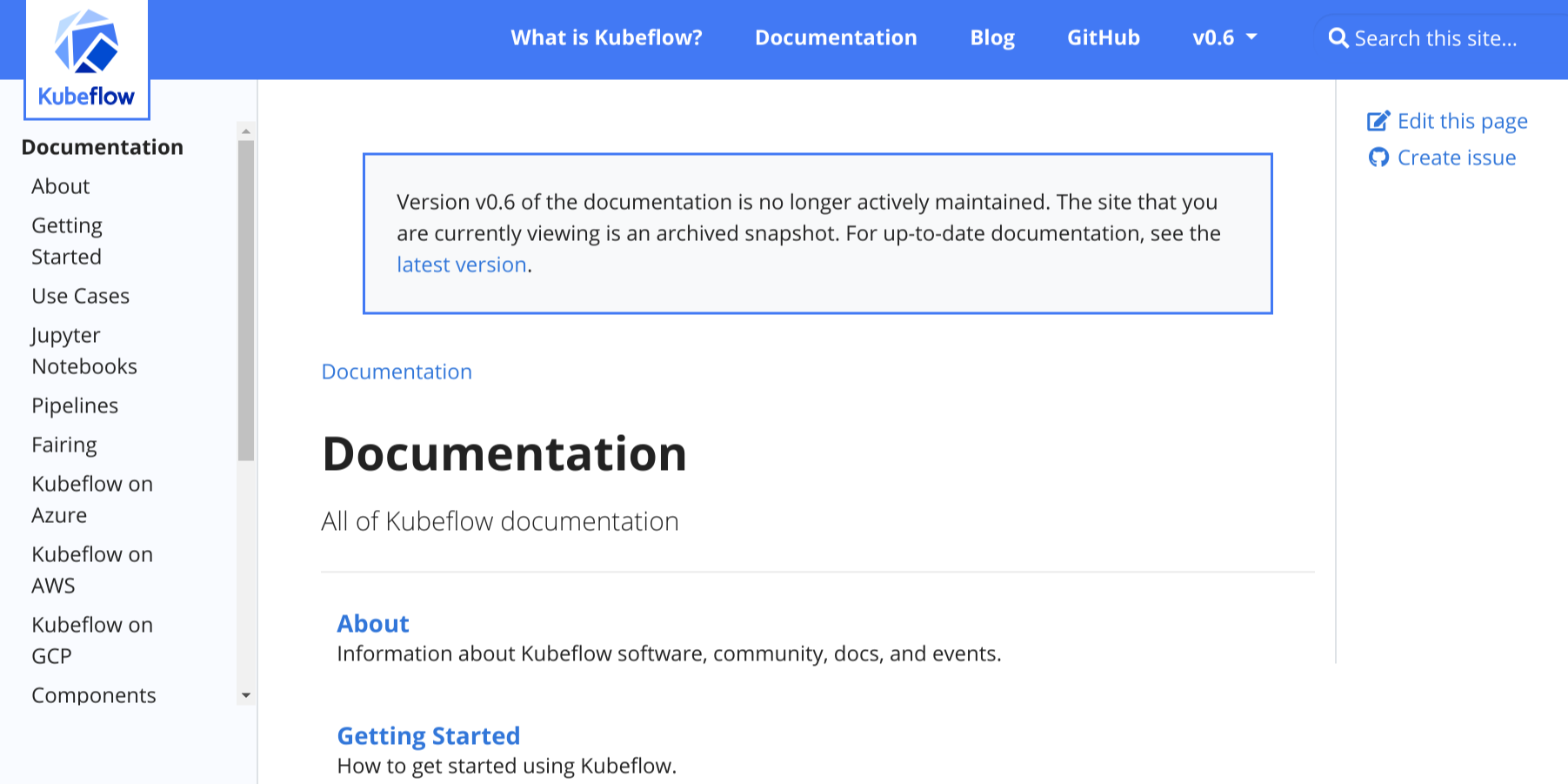
For example, see the archived docs for Kubeflow v0.6:
To add the banner to your doc site, make the following changes in your
hugo.toml/hugo.yaml/hugo.json file:
Set the site parameter
archived_versiontotrue:[params] archived_version = trueparams: archived_version: true{ "params": { "archived_version": true } }Set the site parameter
versionto the version of the archived doc set. For example, if the archived docs are for version 0.1:[params] version = "0.1"params: version: 0.1{ "params": { "version": "0.1" } }Make sure that site parameter
url_latest_versioncontains the URL of the website that you want to point readers to. In most cases, this should be the URL of the latest version of your docs:[params] url_latest_version = "https://your-latest-doc-site.com"params: url_latest_version: https://your-latest-doc-site.com{ "params": { "url_latest_version": "https://your-latest-doc-site.com" } }
6 - Docsy Shortcodes
Rather than writing all your site pages from scratch, Hugo lets you define and use shortcodes. These are reusable snippets of content that you can include in your pages, often using HTML to create effects that are difficult or impossible to do in simple Markdown. Shortcodes can also have parameters that let you, for example, add your own text to a fancy shortcode text box. As well as Hugo’s built-in shortcodes, Docsy provides some shortcodes of its own to help you build your pages.
Shortcode delimiters
As illustrated below, using the bracket styled shortcode delimiter,
{{<...>}}, tells Hugo that the inner content is HTML/plain text and needs
no further processing. By using the delimiter {{%...%}}, Hugo will treat
the shortcode body as Markdown. You can use both styles in your pages.
Shortcode blocks
The theme comes with a set of custom Page Block shortcodes that can be used to compose landing pages, about pages, and similar.
These blocks share some common parameters:
- height: A pre-defined height of the block container. One of
min,med,max,full, orauto. Setting it tofullwill fill the Viewport Height, which can be useful for landing pages. - color: The block will be assigned a color from the theme palette if not
provided, but you can set your own if needed. You can use all of Bootstrap’s
color names, theme color names or a grayscale shade. Some examples would be
primary,white,dark,warning,light,success,300,blue,orange. This will become the background color of the block, but text colors will adapt to get proper contrast.
blocks/cover
The blocks/cover shortcode creates a landing page type of block that fills the top of the page.
{{< blocks/cover title="Welcome!" image_anchor="center" height="full" color="primary" >}}
<div class="mx-auto">
	<a class="btn btn-lg btn-primary me-3 mb-4" href="{{< relref "/docs" >}}">
		Learn More <i class="fa-solid fa-circle-right ms-2"></i>
	</a>
	<a class="btn btn-lg btn-secondary me-3 mb-4" href="https://example.org">
		Download <i class="fa-brands fa-github ms-2"></i>
	</a>
	<p class="lead mt-5">This program is now available in <a href="#">AppStore!</a></p>
	<div class="mx-auto mt-5">
		{{< blocks/link-down color="info" >}}
	</div>
</div>
{{< /blocks/cover >}}
Note that the relevant shortcode parameters above will have sensible defaults, but is included here for completeness.
| Parameter | Default | Description |
|---|---|---|
| title | The main display title for the block. | |
| image_anchor | ||
| height | See above. | |
| color | See above. | |
| byline | Byline text on featured image. |
To set the background image, place an image with the word “background” in the
name in the page’s Page Bundle.
For example, in our the example site the background image in the home page’s
cover block is
featured-background.jpg,
in the same directory.
If you also include the word featured in the image
name, e.g. my-featured-background.jpg, it will also be used as the Twitter
Card image when shared.
For available icons, see Font Awesome.
blocks/lead
The blocks/lead block shortcode is a simple lead/title block with centred text and an arrow down pointing to the next section.
{{% blocks/lead color="dark" %}}
TechOS is the OS of the future.

Runs on **bare metal** in the **cloud**!
{{% /blocks/lead %}}
| Parameter | Default | Description |
|---|---|---|
| height | auto | See Shortcode blocks |
| color | .Ordinal | See Shortcode blocks |
blocks/section
The blocks/section shortcode is meant as a general-purpose content container. It comes in two “flavors”, one for general content and one with styling more suitable for wrapping a horizontal row of feature sections.
The example below shows a section wrapping 3 feature sections.
{{< blocks/section color="dark" type="row" >}}
{{% blocks/feature icon="fa-lightbulb" title="Fastest OS **on the planet**!" %}}
The new **TechOS** operating system is an open source project. It is a new project, but with grand ambitions.
Please follow this space for updates!
{{% /blocks/feature %}}
{{% blocks/feature icon="fa-brands fa-github" title="Contributions welcome!" url="https://github.com/gohugoio/hugo" %}}
We do a [Pull Request](https://github.com/gohugoio/hugo/pulls) contributions workflow on **GitHub**. New users are always welcome!
{{% /blocks/feature %}}
{{% blocks/feature icon="fa-brands fa-x-twitter" title="Follow us on Twitter!" url="https://twitter.com/GoHugoIO" %}}
For announcement of latest features etc.
{{% /blocks/feature %}}
{{< /blocks/section >}}
| Parameter | Default | Description |
|---|---|---|
height | See above. | |
color | See above. | |
type | Specify “container” (the default) if you want a general container, or “row” if the section will contain columns – which must be immediate children. |
blocks/feature
{{% blocks/feature icon="fa-brands fa-github" title="Contributions welcome!" url="https://github.com/gohugoio/hugo" %}}
We do a [Pull Request](https://github.com/gohugoio/hugo/pulls) contributions workflow on **GitHub**. New users are always welcome!
{{% /blocks/feature %}}
| Parameter | Default | Description |
|---|---|---|
| title | The title to use. | |
| url | The URL to link to. | |
| url_text | The language parameter value of ui_read_more | The link text to use. |
| icon | The icon class to use. |
blocks/link-down
The blocks/link-down shortcode creates a navigation link down to the next section. It’s meant to be used in combination with the other blocks shortcodes.
<div class="mx-auto mt-5">
	{{< blocks/link-down color="info" >}}
</div>
| Parameter | Default | Description |
|---|---|---|
| color | info | See above. |
Shortcode helpers
alert
Use the alert shortcode to display notices and warnings. The shortcode renders a Bootstrap alert component. It can be used with Markdown content and contain other shortcodes. For example:
{{% alert title="Welcome" %}} **Hello**, world! {{% /alert %}}
Renders as:
Hello, world!
Parameters:
title(optional): Use this to specify a title for your alert. The title renders as a Bootstrap alert heading, at heading level 4, using theh4Bootstrap class over a<div>element. This prevents the title from appearing in a page’s table of contents.color(optional): Use this parameter to specify one of Bootstrap’s predefined alert variants, each of which has their own color. These includeprimary,info, andwarning.
Alerts and indentation
When the alert shortcode is used in a Markdown context that requires
indentation, such as a list, then the alert content (whether specified as
text/Markdown or a shortcode) must be indented accordingly. For example:
- The following note is part of this list item:
  {{% alert title="Celebrate!" color=success %}}
  This alert content is properly rendered.

  > {{% param message %}}
  {{% /alert %}}
  The first list item continues.

- **Don't put content on the same line** as the opening tag, it breaks rendering:
  {{% alert title="Misformed alert!" color=warning %}} **This content appears outside of
  the list!** {{% /alert %}}
This renders as:
The following note is part of this list item:
Celebrate!This alert content is properly rendered.
Some message.
The first list item continues.
Don’t put content on the same line as the opening tag, it breaks rendering:
Misformed alert!This alert content appears outside of the list!
pageinfo
The pageinfo shortcode creates a text box that you can use to add banner information for a page: for example, letting users know that the page contains placeholder content, that the content is deprecated, or that it documents a beta feature.
{{% pageinfo color="info" %}}
This is placeholder content.
{{% /pageinfo %}}
Renders to:
This is placeholder content
Parameter Default Description color primary One of the theme colors, eg primary,info,warningetc.imgproc
The imgproc shortcode finds an image in the current Page Bundle and scales it given a set of processing instructions.
{{% imgproc spruce Fill "400x450" %}}
Norway Spruce *Picea abies* shoot with foliage buds.
{{% /imgproc %}}
Use the syntax above if the inner content and/or the
bylineparameter of your shortcode is authored in markdown. In case of HTML content, use<>as innermost delimiters:{{< imgproc >}}<b>HTML</b> content{{< /imgproc >}}.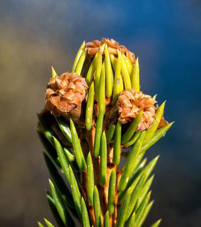
Norway Spruce Picea abies shoot with foliage buds.
Photo: Bjørn Erik Pedersen / CC-BY-SAThe example above has also a byline with photo attribution added. When using illustrations with a free license from WikiMedia and similar, you will in most situations need a way to attribute the author or licensor. You can add metadata to your page resources in the page front matter. The
bylineparam is used by convention in this theme:+++ [[resources]] src = "**spruce*.jpg" [resources.params] byline = "*Photo*: Bjørn Erik Pedersen / CC-BY-SA" +++--- resources: - src: "**spruce*.jpg" params: byline: "*Photo*: Bjørn Erik Pedersen / CC-BY-SA" ---{ "resources": [ { "src": "**spruce*.jpg", "params": { "byline": "*Photo*: Bjørn Erik Pedersen / CC-BY-SA" } } ] }Parameter Description 1 The image filename or enough of it to identify it (we do Glob matching) 2 Command. One of Fit,Resize,FillorCrop. See Image Processing Methods.3 Processing options, e.g. 400x450 r180. See Image Processing Options.swaggerui
You can place the
swaggeruishortcode anywhere inside a page with theswaggerlayout; it renders Swagger UI using any OpenAPI YAML or JSON file as source. This file can be hosted anywhere you like, for example in your site’s root/staticfolder.+++ title = "Pet Store API" type = "swagger" weight = 1 description = "Reference for the Pet Store API" +++ {{< swaggerui src="/openapi/petstore.yaml" >}}--- title: "Pet Store API" type: swagger weight: 1 description: Reference for the Pet Store API --- {{< swaggerui src="/openapi/petstore.yaml" >}}{ "title": "Pet Store API", "type": "swagger", "weight": 1, "description": "Reference for the Pet Store API" } {{< swaggerui src="/openapi/petstore.yaml" >}}You can customize Swagger UI’s look and feel by overriding Swagger’s CSS in
themes/docsy/assets/scss/_swagger.scss.WarningThis shortcode relies on JavaScript libraries hosted on unpkg. Make sure that you can access unpkg from your network when building or loading your site.
redoc
The
redocshortcode uses the open-source Redoc tool to render reference API documentation from an OpenAPI YAML or JSON file. This can be hosted anywhere you like, for example in your site’s root/staticfolder, but you can use a URL as well, for example:--- title: 'Pet Store API' type: docs weight: 1 description: Reference for the Pet Store API --- { { </* redoc "https://raw.githubusercontent.com/OAI/OpenAPI-Specification/main/examples/v2.0/yaml/petstore.yaml" */>, }, }iframe
With this shortcode you can embed external content into a Docsy page as an inline frame (
iframe) - see: https://www.w3schools.com/tags/tag_iframe.aspParameter Default Description src URL of external content width 100% Width of iframe tryautoheight true If true the shortcode tries to calculate the needed height for the embedded content using JavaScript, see details. This is only possible if the embedded content is on the same domain. Note that even if the embedded content is on the same domain, it depends on the structure of the content if the height can be calculated correctly. style min-height:98vh; border:none; CSS styles for the iframe. min-height:98vh;is a backup iftryautoheightdoesn’t work.border:none;removes the border from the iframe - this is useful if you want the embedded content to look more like internal content from your page.sandbox false You can switch the sandbox completely on by setting sandbox = trueor allow specific functionality with the common values for the iframe parametersandboxdefined in the HTML standard.name iframe-name Specify the name of the iframe. id iframe-id Sets the ID of the iframe. class Optional parameter to set the classes of the iframe. sub Your browser cannot display embedded frames. You can access the embedded page via the following link: The text displayed (in addition to the embedded URL) if the user’s browser can’t display embedded frames. WarningYou can only embed external content from a server when its
X-Frame-Optionsis not set or if it specifically allows embedding for your site. See https://developer.mozilla.org/en-US/docs/Web/HTTP/Headers/X-Frame-Options for details.There are several tools you can use to check if a website can be embedded via iframe - e.g.: https://gf.dev/x-frame-options-test. Be aware that when this test says “Couldn’t find the X-Frame-Options header in the response headers.” you CAN embed it, but when the test says “Great! X-Frame-Options header was found in the HTTP response headers as highlighted below.”, you CANNOT - unless it has been explicitly enabled for your site.
Tabbed panes
Sometimes it’s very useful to have tabbed panes when authoring content. One common use-case is to show multiple syntax highlighted code blocks that showcase the same problem, and how to solve it in different programming languages. As an example, the tabbed pane below shows the language-specific variants of the famous
Hello world!program one usually writes first when learning a new programming language:#include <stdio.h> #include <stdlib.h> int main(void) { puts("Hello World!"); return EXIT_SUCCESS; }#include <iostream> int main() { std::cout << "Hello World!" << std::endl; }package main import "fmt" func main() { fmt.Printf("Hello World!\n") }class HelloWorld { static public void main( String args[] ) { System.out.println( "Hello World!" ); } }fun main(args : Array<String>) { println("Hello, world!") }print "Hello world"<?php echo 'Hello World!'; ?>print("Hello World!")puts "Hello World!"object HelloWorld extends App { println("Hello world!") }The Docsy template provides two shortcodes
tabpaneandtabthat let you easily create tabbed panes. To see how to use them, have a look at the following code block, which renders to a right aligned pane with one disabled and three active tabs:{{< tabpane text=true right=true >}} {{% tab header="**Languages**:" disabled=true /%}} {{% tab header="English" lang="en" %}}  Welcome! {{% /tab %}} {{< tab header="German" lang="de" >}} <b>Herzlich willkommen!</b> <img src="flags/de.png" alt="Flag Germany" style="float: right; padding: 0 0 0 0px"> {{< /tab >}} {{% tab header="Swahili" lang="sw" %}}  **Karibu sana!** {{% /tab %}} {{< /tabpane >}}This code translates to the right aligned tabbed pane below, showing a
Welcome!greeting in English, German or Swahili: Welcome!Herzlich willkommen!
 Karibu sana!
Shortcode details
Tabbed panes are implemented using two shortcodes:
tabpanecontaining two or more nestedtabs.tabpaneThe
tabpaneshortcode, which is the container element for the tabs, supports the following named parameters, all of which are optional:lang: the default code-block language to use for all contained tabshighlight: parameter passed on to the code-block highlight function, as described belowlangEqualsHeader: set totruewhen header text matches the tab language.persist: one ofheader,lang, ordisabledpersistLang: deprecated, usepersistinsteadright: set totrueif you want right-aligned tabstext: set totrueif the content of all contained tabs are text. Default isfalseand assumes the content is code.
The value of the optional parameters
langandhighlightare passed on as secondLANGand thirdOPTIONSarguments to Hugo’s built-in highlight function, which is used to render the code blocks of the individual tabs.Tab selection is persisted by default. When unspecified,
persistdefaults toheaderwhentext=trueorlangis set; otherwisepersistdefaults tolang. To disable tab persistence, setpersist=disable.tabThe
tabshortcode represent the tabs you want to show. It supports the following named parameters, all of which are optional:header: defines the tab’s header text. When omitted it defaults to text of the form “Tab n”. You can omit the parameter name if it is the only tab parameter:{{< tab "My tab header" >}} … {{< /tab >}}lang: code-block language for code tabshighlight: parameter passed on to the code-block highlight functionright: set totruein order to split tab panes into a left aligned and a right aligned tab groups. Specifyright=truein the dividing tab. By usingright=truemore than once, you can even render multiple tab groups.disabled: set totrueto disable a tab.text: set totruefor text tabs. By default tabs are assumed to contain code.
For enabled tabs, there are two modes for content display,
coderepresentation and textual representation:- By default, the tab’s content is rendered as a code block. In order to get
proper syntax highlighting, specify the named parameter
lang–and optionally the parameterhighlight– for each tab. Parameters set in the parenttabpaneshortcode will be overwritten. - If the contents of your tabs should be rendered as text with different styles
and optional images, specify
text=trueas parameter of yourtab:
Reminder: If your content is markdown, use the percent sign
%as delimiter for yourtabshortcode, like this:{{% tab %}} Your \*\*markdown\*\* content {{% /tab %}}Card panes
When authoring content, it’s sometimes very useful to put similar text blocks or code fragments on card like elements, which can be optionally presented side by side. Let’s showcase this feature with the following sample card group which shows the first four Presidents of the United States:
George Washington*1732 †1799
President: 1789 – 1797

 John Adams
* 1735 † 1826
President: 1797 – 1801

 Thomas Jefferson
* 1743 † 1826
President: 1801 – 1809

 James Madison
* 1751 † 1836
President: 1809 – 1817


Docsy supports creating such card panes via different shortcodes:
- The
cardpaneshortcode which is the container element for the various cards to be presented. - The
cardshortcodes, with each shortcode representing an individual card. While cards are often presented inside a card group, a single card may stand on its own, too. Acardshortcode can hold programming code, text, images or any other arbitrary kind of markdown or HTML markup as content. In case of programming code, cards provide automatic code-highlighting and other optional features like line numbers, highlighting of certain lines, ….
Shortcode
card: textual contentMake use of the
cardshortcode to display a card. The following code sample demonstrates how to code a card element:{{< card header="**Imagine**" title="Artist and songwriter: John Lennon" subtitle="Co-writer: Yoko Ono" footer="">}} Imagine there's no heaven, It's easy if you try<br/> No hell below us, above us only sky<br/> Imagine all the people living for today… … {{< /card >}}This code translates to the left card shown below, showing the lyrics of John Lennon’s famous song
Imagine. A second explanatory card element to the right indicates and explains the individual components of a card:ImagineArtist and songwriter: John Lennon
Co-writer: Yoko Ono
Imagine there’s no heaven, It’s easy if you try
No hell below us, above us only sky
Imagine all the people living for today…Imagine there’s no countries, it isn’t hard to do
Nothing to kill or die for, and no religion too
Imagine all the people living life in peace…Imagine no possessions, I wonder if you can
No need for greed or hunger - a brotherhood of man
Imagine all the people sharing all the world…You may say I’m a dreamer, but I’m not the only one
I hope someday you’ll join us and the world will live as one Header: specified via named parameter
HeaderCard title: specified via named parameter
titleCard subtitle: specified via named parameter
subtitleContent: inner content of the shortcode, this may be plain text or formatted text, images, videos, … . If your content is markdown, use the percent sign
%as outermost delimiter of yourcardshortcode, your markup should look like{{% card %}}Your **markdown** content{{% /card %}}. In case of HTML content, use square brackets<>as outermost delimiters:{{< card >}}Your <b>HTML</b> content{{< /card >}}While the main content of the card is taken from the inner markup of the
cardshortcode, the optional elementsfooter,header,title, andsubtitleare all specified as named parameters of the shortcode.Shortcode
card: programming codeIf you want to display programming code on your card, set the named parameter
codeof the card totrue. The following sample demonstrates how to code a card element with the famousHello world!application coded in C:{{< card code=true header="**C**" lang="C" >}} #include <stdio.h> #include <stdlib.h> int main(void) { puts("Hello World!"); return EXIT_SUCCESS; } {{< /card >}}This code translates to the card shown below:
C#include <stdio.h> #include <stdlib.h> int main(void) { puts("Hello World!"); return EXIT_SUCCESS; }
If called with parametercode=true, thecardshortcode can optionally hold the named parameterslangand/orhighlight. The values of these optional parameters are passed on as secondLANGand thirdOPTIONSarguments to Hugo’s built-inhighlightfunction which is used to render the code block presented on the card.Card groups
Displaying two ore more cards side by side can be easily achieved by putting them between the opening and closing elements of a
cardpaneshortcode. The general markup of a card group resembles closely the markup of a tabbed pane:{{< cardpane >}} {{< card header="Header card 1" >}} Content card 1 {{< /card >}} {{< card header="Header card 2" >}} Content card 2 {{< /card >}} {{< card header="Header card 3" >}} Content card 3 {{< /card >}} {{< /cardpane >}}Contrary to tabs, cards are presented side by side, however. This is especially useful it you want to compare different programming techniques (traditional vs. modern) on two cards, like demonstrated in the example above:
Java 5File[] hiddenFiles = new File("directory_name") .listFiles(new FileFilter() { public boolean accept(File file) { return file.isHidden(); } });Java 8, Lambda expressionFile[] hiddenFiles = new File("directory_name") .listFiles(File::isHidden);Include external files
Sometimes there’s content that is relevant for several documents, or that is maintained in a file that is not necessarily a document. For situations like these, the
readfileshortcode allows you to import the contents of an external file into a document.Reuse documentation
In case you want to reuse some content in several documents, you can write said content in a separate file and include it wherever you need it.
For example, suppose you have a file called
installation.mdwith the following contents:## Installation {{% alert title="Note" color="primary" %}} Check system compatibility before proceeding. {{% /alert %}} 1. Download the installation files. 1. Run the installation script `sudo sh install.sh` 1. Test that your installation was successfully completed.You can import this section into another document:
The following section explains how to install the database:

{{% readfile "installation.md" %}}
This is rendered as if the instructions were in the parent document. Hugo v0.101.0+ is required for imported files containing shortcodes to be rendered correctly.
The following section explains how to install the database:
Installation
NoteCheck system compatibility before proceeding.
Download the installation files.
Run the installation script
sudo sh install.shTest that your installation was successfully completed.
The parameter is the relative path to the file. Only relative paths under the parent file’s working directory are supported.
For files outside the current working directory you can use an absolute path starting with
/. The root directory is the/contentfolder.Include code files
Suppose you have an
includesfolder containing several code samples you want to use as part of your documentation. You can usereadfilewith some additional parameters:To create a new pipeline, follow the next steps: 1. Create a configuration file `config.yaml`: {{< readfile file="includes/config.yaml" code="true" lang="yaml" >}} 1. Apply the file to your cluster `kubectl apply config.yaml`This code automatically reads the content of
includes/config.yamland inserts it into the document. The rendered text looks like this:To create a new pipeline, follow the next steps:
Create a configuration file
config.yaml:apiVersion: tekton.dev/v1beta1 kind: Task metadata: name: hello spec: steps: - name: echo image: alpine script: | #!/bin/sh echo "Hello World"Apply the file to your cluster
kubectl apply config.yaml
WarningYou must use
{{< >}}delimiters for the code highlighting to work correctly.The
fileparameter is the relative path to the file. Only relative paths under the parent file’s working directory are supported.For files outside the current working directory you can use an absolute path starting with
/. The root directory is the/contentfolder.Parameter Default Description file Path of external file code false Boolean value. If truethe contents is treated as codelang plain text Programming language Error reporting
If the shortcode can’t find the specified file, the shortcode throws a compile error.
In the following example, Hugo throws a compile error if it can’t find
includes/deploy.yml:{{< readfile file="includes/deploy.yaml" code="true" lang="yaml" >}}Alternately, Hugo you can display a message on the rendered page instead of throwing a compile error. Add
draft="true"as a parameter. For example:{{< readfile file="includes/deploy.yaml" code="true" lang="yaml" draft="true" >}}Conditional text
The
conditional-textshortcode allows you to show or hide parts of your content depending on the value of thebuildConditionparameter set in your configuration file. This can be useful if you are generating different builds from the same source, for example, using a different product name. This shortcode helps you handle the minor differences between these builds.{{% conditional-text include-if="foo" %}} This text appears in the output only if `buildCondition = "foo" is set in your config file`. {{% /conditional-text %}} {{% conditional-text exclude-if="bar" %}} This text does not appear in the output if `buildCondition = "bar" is set in your config file`. {{% /conditional-text %}}If you are using this shortcode, note that when evaluating the conditions, substring matches are matches as well. That means, if you set
include-if="foobar", andbuildcondition = "foo", you have a match!
7 - Logos and Images
Add your logo
By default, Docsy shows a site logo at the start of the navbar, that is, at the
extreme left. Place your project’s SVG logo in assets/icons/logo.svg. This
overrides the default Docsy logo in the theme.
If you don’t want a logo to appear in the navbar, then set site parameter
navbar_logo to false in your project’s config:
[params.ui]
navbar_logo = falseparams:
ui:
navbar_logo: false{
"params": {
"ui": {
"navbar_logo": false
}
}
}For information about styling your logo, see Styling your project logo and name.
Use icons
Docsy includes the free FontAwesome icons by default, including logos for sites
like GitHub and Stack Overflow. You can view all available icons in the
FontAwesome documentation, including the
FontAwesome version when the icon was added and whether it is available for free
tier users. Check Docsy’s
package.json and
release notes for Docsy’s currently included version of FontAwesome.
You can add FontAwesome icons to your top-level menu, section menu, or anywhere in your text.
Add your favicons
The easiest way to do this is to create a set of favicons via
https://cthedot.de/icongen (which lets you create a huge range of icon sizes and
options from a single image) and/or https://favicon.io,
and put them in your site project’s static/favicons directory. This will
override the default favicons from the theme.
Note that https://favicon.io doesn’t create as wide a range of sizes as Icongen
but does let you quickly create favicons from text: if you want to create text
favicons you can use this site to generate them, then use Icongen to create more
sizes (if necessary) from your generated .png file.
If you have special favicon requirements, you can create your own
layouts/_partials/favicons.html with your links.
Add images
Landing pages
Docsy’s blocks/cover shortcode
make it easy to add large cover images to your landing pages. The shortcode
looks for an image with the word “background” in the name inside the landing
page’s Page Bundle - so,
for example, if you’ve copied the example site, the landing page image in
content/en/_index.html is content/en/featured-background.jpg.
You specify the preferred display height of a cover block container (and hence
its image) using the block’s height parameter. For a full viewport height, use
full:
{{< blocks/cover title="Welcome to the Docsy Example Project!" image_anchor="top" height="full" >}}
...
{{< /blocks/cover >}}
For a shorter image, as in the example site’s About page, use one of min,
med, max or auto (the actual height of the image):
{{< blocks/cover title="About the Docsy Example" image_anchor="bottom" height="min" >}}
...
{{< /blocks/cover >}}
Other pages
To add inline images to other pages, use the
imgproc shortcode. Alternatively,
if you prefer, just use regular Markdown or HTML images and add your image files
to your project’s static directory. You can find out more about using this
directory in
Adding static content.
8 - Print Support
Individual documentation pages print well from most browsers as the layouts have been styled to omit navigational chrome from the printed output.
On some sites, it can be useful to enable a “print entire section” feature (as seen in this user guide). Selecting this option renders the entire current top-level section (such as Content and Customization for this page) with all of its child pages and sections in a format suited to printing, complete with a table of contents for the section.
To enable this feature, add the “print” output format in your site’s
hugo.toml/hugo.yaml/hugo.json file for the “section” type:
[outputs]
section = [ "HTML", "RSS", "print" ]outputs:
section:
- HTML
- RSS
- print{
"outputs": {
"section": [
"HTML",
"RSS",
"print"
]
}
}The site should then show a “Print entire section” link in the right hand navigation.
Further Customization
Disabling the ToC
To disable showing the the table of contents in the printable view, set the
disable_toc param to true, either in the page front matter, or in
hugo.toml/hugo.yaml/hugo.json:
+++
…
disable_toc = true
…
+++
---
…
disable_toc: true
…
---{
…,
"disable_toc": true,
…
}[params.print]
disable_toc = trueparams:
print:
disable_toc: true{
"params": {
"print": {
"disable_toc": true
}
}
}Layout hooks
A number of layout partials and hooks are defined that can be used to customize
the printed format. These can be found in layouts/_partials/print.
Hooks can be defined on a per-type basis. For example, you may want to customize
the layouts of heading for “blog” pages vs “docs”. This can be achieved by
creating layouts/_partials/print/page-heading-<type>.html such as
page-heading-blog.html. It defaults to using the page title and description as
a heading.
Similarly, the formatting for each page can be customized by creating
layouts/_partials/print/content-<type>.html.
9 - Analytics, User Feedback, and SEO
Adding Analytics
The Docsy theme builds upon Hugo’s support for Google Analytics, which Hugo provides through embedded templates. Once you set up analytics as described below, usage information for your site (such as page views) is sent to your Google Analytics account.
Prerequisites
You will need an analytics ID for your website before proceeding (technically it’s called a measurement ID or property ID but we’ll use the term “analytics ID” in this guide). If you don’t have one, see the How to get started section of Introducing Google Analytics 4 (GA4).
Your project’s analytics ID is a string that starts with G- (a GA4
measurement ID) or UA- (a universal analytics property ID).
Setup
Enable Google Analytics by adding your project’s analytics ID to the site configuration file. For details, see Configure Google Analytics.
While you can configure your project’s analytics ID by setting either the
top-level googleAnalytics config parameter or services.googleAnalytics.id,
googleAnalytics was deprecated in Hugo 0.120.0 and will be
removed in a future release.
Do not define both parameters, otherwise this can result in unexpected behavior. For details, see Is services.googleAnalytics.id an alias for googleAnalytics.
Analytics are enabled only for production builds (called “environments” in Hugo terminology). For information about Hugo environments and how to set them, see the following discussion.
User Feedback
By default Docsy puts a “was this page helpful?” feedback widget at the bottom of every documentation page, as shown in Figure 1.
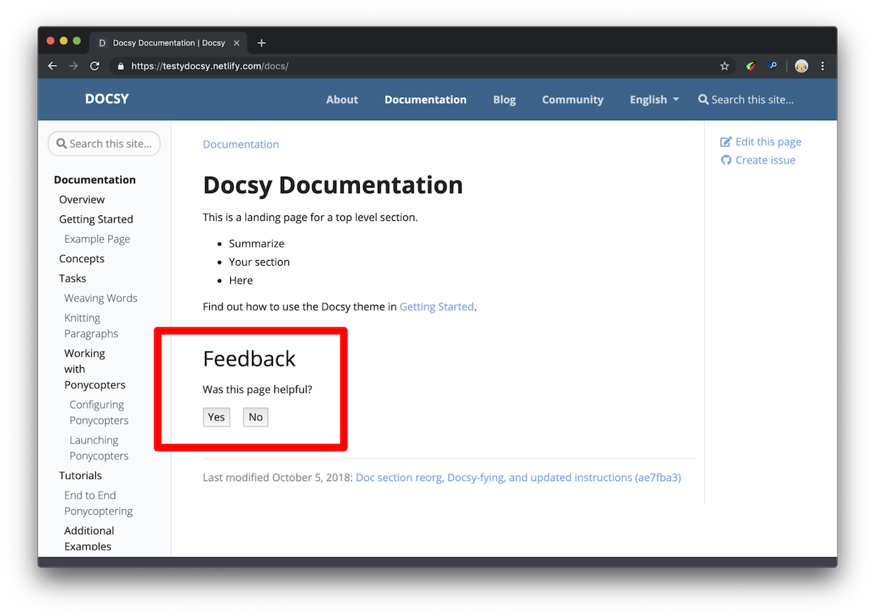
After clicking Yes the user should see a response like Figure 2. You can configure the response text in your project’s configuration file.
How is this data useful?
When you have a lot of documentation, and not enough time to update it all, you can use the “was this page helpful?” feedback data to help you decide which pages to prioritize. In general, start with the pages with a lot of pageviews and low ratings. “Low ratings” in this context means the pages where users are clicking No — the page wasn’t helpful — more often than Yes — the page was helpful. You can also study your highly-rated pages to develop hypotheses around why your users find them helpful.
In general, you can develop more certainty around what patterns your users find helpful or unhelpful if you introduce isolated changes in your documentation whenever possible. For example, suppose that you find a tutorial that no longer matches the product. You update the instructions, check back in a month, and the score has improved. You now have a correlation between up-to-date instructions and higher ratings. Or, suppose you study your highly-rated pages and discover that they all start with code samples. You find 10 other pages with their code samples at the bottom, move the samples to the top, and discover that each page’s score has improved. Since this was the only change you introduced on each page, it’s more reasonable to believe that your users find code samples at the top of pages helpful. The scientific method, applied to technical writing, in other words!
Setup
As of Docsy version 0.8.0, feedback will be enabled whether
site.Config.Services.GoogleAnalytics.ID is set or not. This supports the use
case where analytics is configured outside of Docsy.
Open your project’s Hugo configuration file.
Set the response text that users see after clicking Yes or No.
[params.ui.feedback] enable = true yes = 'Glad to hear it! Please <a href="https://github.com/USERNAME/REPOSITORY/issues/new">tell us how we can improve</a>.' no = 'Sorry to hear that. Please <a href="https://github.com/USERNAME/REPOSITORY/issues/new">tell us how we can improve</a>.'params: ui: feedback: enable: true 'yes': >- Glad to hear it! Please <a href="https://github.com/USERNAME/REPOSITORY/issues/new"> tell us how we can improve</a>. 'no': >- Sorry to hear that. Please <a href="https://github.com/USERNAME/REPOSITORY/issues/new"> tell us how we can improve</a>.{ "params": { "ui": { "feedback": { "enable": true, "yes": "Glad to hear it! Please <a href=\"https://github.com/USERNAME/REPOSITORY/issues/new\"> tell us how we can improve</a>.", "no": "Sorry to hear that. Please <a href=\"https://github.com/USERNAME/REPOSITORY/issues/new\"> tell us how we can improve</a>." } } } }
- Save the edits to your configuration file.
By default, Docsy emits an event value of 100 when a user clicks “yes”. You can
change this value by setting params.ui.feedback.max_value to a positive
integer. Docsy uses 0 for “no” events.
Access the feedback data
Page feedback is reported to Google Analytics through events.
As of Docsy version 0.8.0, page feedback is reported as custom page_helpful
events, rather than click events.
This section assumes basic familiarity with Google Analytics. For example, you should know how to check pageviews over a certain time range and navigate between accounts if you have access to multiple documentation sites.
- Open Google Analytics.
- Open Reports > Engagement > Events.
- Click page_helpful in the events table. If there is no
page_helpfulevent, then none have been registered for the selected period. Adjust the period as necessary.
Note that you might be required to create a custom report if you’d like better visualize individual data points (per page) along with average values.
Disable feedback on a single page
Add the parameter hide_feedback to the page’s front matter and set it to
true.
+++
hide_feedback = true
+++
---
hide_feedback: true
---{
"hide_feedback": true
}Disable feedback on all pages
Set params.ui.feedback.enable to false in
hugo.toml/hugo.yaml/hugo.json:
[params.ui.feedback]
enable = falseparams:
ui:
feedback:
enable: false{
"params": {
"ui": {
"feedback": {
"enable": false
}
}
}
}Add a contact form with Fabform
You can create a contact form for your site and collect your form submissions at fabform.io. To use this feature, you first need to sign up for an account with Fabform. The following example shows how to add a simple form that collects the user’s email address to your site source:
<form action="https://fabform.io/f/{form-id}" method="post">
  <label for="email">Your Email</label>
  <input name="email" type="email" />
  <button type="submit">Submit</button>
</form>
For more details, see Add a Hugo contact form in the Fabform documentation.
Search Engine Optimization meta tags
To learn how to optimize your site for SEO see, Search Engine Optimization (SEO) Starter Guide.
Google
recommends
using the description meta tag to tell search engines what your page is about.
For each generated page, Docsy will set the content of the meta description by
using the first of the following that is defined:
- The page
descriptionfrontmatter field - For non-index pages, the page summary, as computed by Hugo
- The site description taken from the site
params
For the code used to perform this computation, see page-description.html.
Add more meta tags as needed to your project’s copy of the head-end.html
partial. For details, see
Customizing templates.
10 - Repository Links and other page information
The Docsy docs and blog layouts include links for readers to edit the page or create issues for your docs or project via your site’s source repository. The current generated links for each docs or blog page are:
- View page source: Brings the user to the page source in your docs repo.
- Edit this page: Brings the user to an editable version of the page content in their fork (if available) of your docs repo. If the user doesn’t have a current fork of your docs repo, they are invited to create one before making their edit. The user can then create a pull request for your docs.
- Create child page: Brings the user to a create new file form in their fork
of your docs repo. The new file will be located as a child of the page they
clicked the link on. The form will be pre-populated with a template the user
can edit to create their page. You can change this by adding
assets/stubs/new-page-template.mdto your own project. - Create documentation issue: Brings the user to a new issue form in your docs repo with the name of the current page as the issue’s title.
- Create project issue (optional): Brings the user to a new issue form in your project repo. This can be useful if you have separate project and docs repos and your users want to file issues against the project feature being discussed rather than your docs.
This page shows you how to configure these links.
Currently, Docsy supports only GitHub repository links “out of the box”. Since GitLab can handle the same link scheme, it should work as well. If you are using another repository such as Bitbucket and would like generated repository links, feel free to add a feature request or update our theme.
Link configuration
There are four site variables you can configure in
hugo.toml/hugo.yaml/hugo.json to set up links, as well as one in your page
metadata.
github_repo
The URL for your site’s source repository. This is used to generate the Edit this page, Create child page, and Create documentation issue links.
[params]
github_repo = "https://github.com/google/docsy"params:
github_repo: https://github.com/google/docsy{
"params": {
"github_repo": "https://github.com/google/docsy"
}
}github_subdir (optional)
Specify a value here if your content directory is not in your repo’s root
directory. For example, this site is in the userguide subdirectory of its
repo. Setting this value means that your edit links will go to the right page.
[params]
github_subdir = "userguide"params:
github_subdir: userguide{
"params": {
"github_subdir": "userguide"
}
}github_project_repo (optional)
Specify a value here if you have a separate project repo and you’d like your users to be able to create issues against your project from the relevant docs. The Create project issue link appears only if this is set.
[params]
github_project_repo = "https://github.com/google/docsy"params:
github_project_repo: https://github.com/google/docsy{
"params": {
"github_project_repo": "https://github.com/google/docsy"
}
}github_branch (optional)
Specify a value here if you have would like to reference a different branch for the other github settings like Edit this page or Create project issue.
[params]
github_branch = "release"params:
github_branch: release{
"params": {
"github_branch": "release"
}
}path_base_for_github_subdir (optional)
Suppose that the source files for all of the pages under content/some-section
come from another repo, such as a git submodule. Add settings like these to
the section’s index page so that the repository links for all pages in that
section refer to the originating repo:
+++
title = "Some super section"
[cascade]
github_repo = "https://github.com/some-username/another-repo/"
github_subdir = "docs"
path_base_for_github_subdir = "content/some-section"
…
+++
---
title: Some super section
cascade:
github_repo: https://github.com/some-username/another-repo/
github_subdir: docs
path_base_for_github_subdir: content/some-section
…
---{
"title": "Some super section",
"cascade": {
"github_repo": "https://github.com/some-username/another-repo/",
"github_subdir": "docs",
"path_base_for_github_subdir": "content/some-section"
}
}As an example, consider a page at the path
content/some-section/subpath/some-page.md with github_branch globally set to
main. The index page settings above will generate the following edit link for
some-page.md:
https://github.com/some-username/another-repo/edit/main/docs/subpath/some-page.md
If you only have a single page originating from another repo, then omit the
cascade key and write, at the top-level, the same settings as illustrated
above.
If you’d like users to create project issues in the originating repo as well,
then also set github_project_repo, something like this:
---
---
cascade:
  github_repo: &repo https://github.com/some-username/another-repo/
  github_project_repo: *repo
---
+++
…
[cascade]
github_repo = "https://github.com/some-username/another-repo/"
github_project_repo = "https://github.com/some-username/another-repo/"
…
+++
---
…
cascade:
github_repo: &repo https://github.com/some-username/another-repo/
github_project_repo: *repo
…
---{
"cascade": {
"github_repo": "https://github.com/some-username/another-repo/",
"github_project_repo": "https://github.com/some-username/another-repo/"
}
}Please note that the YAML code fragment makes use of Yaml anchor. Use of Yaml anchors is optional, but it helps keep the settings DRY.
The path_base_for_github_subdir setting is a regular expression, so you can
use it even if you have a site with multiple languages for example:
+++
…
path_base_for_github_subdir = "content/\w+/some-section"
…
+++
---
…
path_base_for_github_subdir: content/\w+/some-section
…
---{
…
"path_base_for_github_subdir": "content/\w+/some-section"
…
}In situations where a page originates from a file under a different name, you
can specify from and to path-rename settings. Here’s an example where an
index file is named README.md in the originating repo:
+++
…
github_repo = "https://github.com/some-username/another-repo/"
github_subdir = "docs"

[path_base_for_github_subdir]
from = "content/some-section/(.*?)/_index.md"
to = "$1/README.md"
…
+++
---
…
github_repo: https://github.com/some-username/another-repo/
github_subdir: docs
path_base_for_github_subdir:
from: content/some-section/(.*?)/_index.md
to: $1/README.md
…
---{
…
"github_repo": "https://github.com/some-username/another-repo/",
"github_subdir": "docs",
"path_base_for_github_subdir": {
"from": "content/some-section/(.*?)/_index.md",
"to": "$1/README.md"
},
…
}github_url (optional)
This setting is deprecated. Use path_base_for_github_subdir instead.
Specify a value for this in your page metadata to set a specific edit URL for this page, as in the following example:
+++
title = "Some page"
github_url = "https://github.com/some-username/another-repo/edit/main/README.md"
…
+++---
title: Some page
github_url: https://github.com/some-username/another-repo/edit/main/README.md
…
---{
"title": "Some page",
"github_url": "https://github.com/some-username/another-repo/edit/main/README.md",
…
}This can be useful if you have page source files in multiple Git repositories, or require a non-GitHub URL. Pages using this value have Edit this page links only.
Disabling links
You can use CSS to selectively hide links. For example, add the following to
your projects’s _styles_project.scss file to hide
Create child page links from all pages (optionally with a !important
modifier – not shown):
.td-page-meta__child {
display: none;
}
Each link kind has an associated unique class named .td-page-meta__KIND, as
defined by the following table:
| Link kind | Class name |
|---|---|
| View page source | .td-page-meta__view |
| Edit this page | .td-page-meta__edit |
| Create child page | .td-page-meta__child |
| Create documentation issue | .td-page-meta__issue |
| Create project issue | .td-page-meta__project-issue |
Of course, you can also use these classes to give repository links unique styles for your project.
Class names using the --KIND suffix were deprecated as of v0.9.0.
Last-modified page metadata
To have page-source metadata displayed at the bottom of documentation pages and
blog posts, set the GitInfo configuration parameter to true, and ensure that
params.github_repo is defined.
A last-modified page note looks something like this:
{.border-0}
Once enabled site-wide, you can selectively hide last-modified notes in a page
or section by declaring the following style (optionally with a !important
modifier — not shown):
.td-page-meta__lastmod {
display: none;
}
11 - Taxonomy Support
Docsy supports Hugo taxonomies in its docs and blog section. You can see the default layout and can test the behavior of the generated links on this page.
Terminology
To understand the usage of taxonomies you should understand the following terminology:
Taxonomy: a categorization that can be used to classify content - e.g.: Tags, Categories, Projects, People
Term: a key within the taxonomy - e.g. within projects: Project A, Project B
Value: a piece of content assigned to a term - e.g. a page of your site, that belongs to a specific project
A movie-website sample taxonomy is provided by the Hugo docs.
Parameters
There are various parameter to control the functionality of taxonomies in the
project configuration file. Taxonomies are enabled by default for tags
and categories in Hugo. To disable taxonomies, add the following to your
project config:
disableKinds = ["taxonomy"]disableKinds: [taxonomy]{
"disableKinds": [ "taxonomy" ]
}Then the taxonomy pages for tags and categories will be generated by Hugo.
If you want to use other taxonomies you have to define them in your
configuration file. If you want to use beside your own taxonomies also the
default taxonomies tags and categories, you also have to define them beside
your own taxonomies. You need to provide both the plural and singular labels for
each taxonomy.
With the following example you define a additional taxonomy projects beside
the default taxonomies tags and categories:
[taxonomies]
tag = "tags"
category = "categories"
project = "projects"taxonomies:
tag: tags
category: categories
project: projects{
"taxonomies": {
"tag": "tags",
"category": "categories",
"project": "projects"
}
}You can use the following parameters in your project’s config to control the output of the assigned taxonomy terms for each article resp. page of your docs and/or blog section in Docsy or a “tag cloud” in Docsy’s right sidebar:
[params.taxonomy]
taxonomyCloud = ["projects", "tags"] # set taxonomyCloud = [] to hide taxonomy clouds
taxonomyCloudTitle = ["Our Projects", "Tag Cloud"] # if used, must have same length as taxonomyCloud
taxonomyPageHeader = ["tags", "categories"] # set taxonomyPageHeader = [] to hide taxonomies on the page headersparams:
taxonomy:
taxonomyCloud:
- projects # remove all entries
- tags # to hide taxonomy clouds
taxonomyCloudTitle: # if used, must have the same
- Our Projects # number of entries as taxonomyCloud
- Tag Cloud
taxonomyPageHeader:
- tags # remove all entries
- categories # to hide taxonomy clouds{
"params": {
"taxonomy": {
"taxonomyCloud": [
"projects",
"tags"
],
"taxonomyCloudTitle": [
"Our Projects",
"Tag Cloud"
],
"taxonomyPageHeader": [
"tags",
"categories"
]
}
}
}The settings above would only show a taxonomy cloud for projects and tags
(with the headlines “Our Projects” and “Tag Cloud”) in Docsy’s right sidebar and
the assigned terms for the taxonomies tags and categories for each page.
To disable any taxonomy cloud you have to set the Parameter taxonomyCloud = []
resp. if you don’t want to show the assigned terms you have to set
taxonomyPageHeader = [].
As default the plural label of a taxonomy is used as it cloud title. You can
overwrite the default cloud title with taxonomyCloudTitle. But if you do so,
you have to define a manual title for each enabled taxonomy cloud
(taxonomyCloud and taxonomyCloudTitle must have the same length!).
If you don’t set the parameters taxonomyCloud resp. taxonomyPageHeader the
taxonomy clouds resp. assigned terms for all defined taxonomies will be
generated.
Partials
The by default used partials for displaying taxonomies are so defined, that you should be able to use them also easily in your own layouts.
taxonomy_terms_article
The partial taxonomy_terms_article shows all assigned terms of an given
taxonomy (partial parameter taxo) of an article respectively page (partial
parameter context, most of the time the current page or context .).
Example usage in layouts/docs/list.html for the header of each page in the
docs section:
{{ $context := . }}
{{ range $taxo, $taxo_map := .Site.Taxonomies }}
{{ partial "taxonomy_terms_article.html" (dict "context" $context "taxo" $taxo ) }}
{{ end }}
This will gave you for each in the current page (resp. context) defined taxonomy a list with all assigned terms:
<div class="taxonomy taxonomy-terms-article taxo-categories">
<h5 class="taxonomy-title">Categories:</h5>
<ul class="taxonomy-terms">
<li>
<a
class="taxonomy-term"
href="//localhost:1313/categories/taxonomies/"
data-taxonomy-term="taxonomies"
><span class="taxonomy-label">Taxonomies</span></a
>
</li>
</ul>
</div>
<div class="taxonomy taxonomy-terms-article taxo-tags">
<h5 class="taxonomy-title">Tags:</h5>
<ul class="taxonomy-terms">
<li>
<a
class="taxonomy-term"
href="//localhost:1313/tags/tagging/"
data-taxonomy-term="tagging"
><span class="taxonomy-label">Tagging</span></a
>
</li>
<li>
<a
class="taxonomy-term"
href="//localhost:1313/tags/structuring-content/"
data-taxonomy-term="structuring-content"
><span class="taxonomy-label">Structuring Content</span></a
>
</li>
<li>
<a
class="taxonomy-term"
href="//localhost:1313/tags/labelling/"
data-taxonomy-term="labelling"
><span class="taxonomy-label">Labelling</span></a
>
</li>
</ul>
</div>
taxonomy_terms_article_wrapper
The partial taxonomy_terms_article_wrapper is a wrapper for the partial
taxonomy_terms_article with the only parameter context (most of the time the
current page or context .) and checks the taxonomy parameters of your
project’s hugo.toml/hugo.yaml/hugo.json to loop threw all listed
taxonomies in the parameter taxonomyPageHeader resp. all defined taxonomies of
your page, if taxonomyPageHeader isn’t set.
taxonomy_terms_cloud
The partial taxonomy_terms_cloud shows all used terms of an given taxonomy
(partial parameter taxo) for your site (partial parameter context, most of
the time the current page or context .) and with the parameter title as
headline.
Example usage in partial taxonomy_terms_clouds for showing all defined
taxonomies and its terms:
{{ $context := . }}
{{ range $taxo, $taxo_map := .Site.Taxonomies }}
{{ partial "taxonomy_terms_cloud.html" (dict "context" $context "taxo" $taxo "title" ( humanize $taxo ) ) }}
{{ end }}
This will give you the following HTML markup for the taxonomy categories:
<div class="taxonomy taxonomy-terms-cloud taxo-categories">
<h5 class="taxonomy-title">Cloud of Categories</h5>
<ul class="taxonomy-terms">
<li>
<a
class="taxonomy-term"
href="//localhost:1313/categories/category-1/"
data-taxonomy-term="category-1"
><span class="taxonomy-label">category 1</span
><span class="taxonomy-count">3</span></a
>
</li>
<li>
<a
class="taxonomy-term"
href="//localhost:1313/categories/category-2/"
data-taxonomy-term="category-2"
><span class="taxonomy-label">category 2</span
><span class="taxonomy-count">1</span></a
>
</li>
<li>
<a
class="taxonomy-term"
href="//localhost:1313/categories/category-3/"
data-taxonomy-term="category-3"
><span class="taxonomy-label">category 3</span
><span class="taxonomy-count">2</span></a
>
</li>
<li>
<a
class="taxonomy-term"
href="//localhost:1313/categories/category-4/"
data-taxonomy-term="category-4"
><span class="taxonomy-label">category 4</span
><span class="taxonomy-count">6</span></a
>
</li>
</ul>
</div>
taxonomy_terms_clouds
The partial taxonomy_terms_clouds is a wrapper for the partial
taxonomy_terms_cloud with the only parameter context (most of the time the
current page or context .) and checks the taxonomy parameters of your
project’s config to loop threw all listed taxonomies in the parameter
taxonomyCloud resp. all defined taxonomies of your page, if taxonomyCloud
isn’t set.
Multi language support for taxonomies
For multilingual sites, taxonomy terms get counted and linked within the language site only. Taxonomy config parameters can be adjusted per language.
12 - Diagrams and Formulae
Docsy has built-in support for a number of diagram creation and typesetting tools you can use to add rich content to your site, including \(\KaTeX\), Mermaid, Diagrams.net, PlantUML, and MarkMap.
\(\LaTeX\) support with \(\KaTeX\)
\(\LaTeX\) is a high-quality typesetting
system for the production of technical and scientific documentation. Due to its
excellent math typesetting capabilities, \(\TeX\) became the de facto standard
for the communication and publication of scientific documents, especially if
these documents contain a lot of mathematical formulae. Designed and mostly
written by Donald Knuth, the initial version was released in 1978. Dating back
that far, \(\LaTeX\) has pdf as its primary output target and is not
particularly well suited for producing HTML output for the Web. Fortunately,
with \(\KaTeX\) there exists a fast and easy-to-use
JavaScript library for \(\TeX\) math rendering on the web, which was integrated
into the Docsy theme.
With \(\KaTeX\) support enabled in Docsy, you can include complex mathematical formulae into your web page, either inline or centred on its own line. Since \(\KaTeX\) relies on server side rendering, it produces the same output regardless of your browser or your environment. Formulae can be shown either inline or in display mode:
Inline formulae
The following code sample produces a text line with three inline formulae:
When \(a \ne 0\), there are two solutions to \(ax^2 + bx + c= 0\) and they are \(x = {-b \pm \sqrt{b^2-4ac} \over 2a}\).
When \(a \ne 0\), there are two solutions to \(ax^2 + bx + c= 0\) and they are \(x = {-b \pm \sqrt{b^2-4ac} \over 2a}\).
Formulae in display mode
The following code sample produces an introductory text line followed by a
formula numbered as (1) residing on its own line:
The probability of getting \(k\) heads when flipping \(n\) coins is:
\[
\tag*{(1)} P(E) = {n \choose k} p^k (1-p)^{n-k}
\]
As an alternative to the standard syntax used above, formulae can also be authored using a GLFM math block:
The probability of getting \(k\) heads when flipping \(n\) coins is:
```math
\tag*{(1)} P(E) = {n \choose k} p^k (1-p)^{n-k}
```
Both standard syntax and math block render to the same formula:
The probability of getting \(k\) heads when flipping \(n\) coins is:
In order to display mathematical formulae and/or chemical equations in your page(s), you need to run Hugo version 0.141.0 or above. With older Hugo versions, an error is thrown.
This wiki page provides in-depth information about typesetting mathematical formulae using the \(\LaTeX\) typesetting system.
\(\LaTeX\) typesetting using standard syntax
As of Hugo v0.122, you can enable \(\LaTeX\) typesetting in Markdown using the
standard syntax. To do so, use the goldmark passthrough extension inside your
hugo.toml/hugo.yaml/hugo.json:
[markup]
[markup.goldmark]
[markup.goldmark.extensions]
[markup.goldmark.extensions.passthrough]
enable = true
[markup.goldmark.extensions.passthrough.delimiters]
block = [['\[', '\]'], ['$$', '$$']]
inline = [['\(', '\)']]markup:
goldmark:
extensions:
passthrough:
enable: true
delimiters:
block: [['\[', '\]'], ['$$', '$$']]
inline: [['\(', '\)']]{
"markup": {
"goldmark": {
"extensions": {
"passthrough": {
"delimiters": {
"block": [
[
"\\[",
"\\]"
],
[
"$$",
"$$"
]
],
"inline": [
[
"\\(",
"\\)"
]
]
},
"enable": true
}
}
}
}
}You can edit this definition to meet your own needs. For details, see the official Hugo docs.
Activating and configuring \(\KaTeX\) support
Auto activation
As soon as you use a math code block on your page, support of \(\KaTeX\) is
automatically enabled.
Manual activation (use of standard syntax, no math code block present)
If you want to use formulae (block or inline) and don’t have a math code block
present in your page which triggers auto activation, you need to manually
activate \(\KaTeX\) support. The easiest way to do so is to add a math
attribute to the frontmatter of your page and set it to true:
+++
math = true
+++---
math: true
---{
"math": true
}If you use formulae in most of your pages, you can also enable sitewide
\(\KaTeX\) support inside the Docsy theme. To do so update
hugo.toml/hugo.yaml/hugo.json:
[params.katex]
enable = trueparams:
katex:
enable: true{
"params": {
"katex": {
"enable": true
}
}
}By default, Docsy pulls in the latest officially released version of \(\KaTeX\)
/ mhchem extension at build time. If that doesn’t fit your needs, you can
specify the \(\KaTeX\) version you want in your configuration file
hugo.toml/hugo.yaml/hugo.json:
[params.katex]
version = "0.16.22"params:
katex:
version: 0.16.22{
"params": {
"katex": {
"version": "0.16.22"
}
}
}[params.katex]
# enable/disable KaTeX support
enable = true
# Element(s) scanned by auto render extension. Default: document.body
html_dom_element = "document.body"
[params.katex.options]
# If true (the default), KaTeX will throw a ParseError when it encounters an
# unsupported command or invalid LaTeX. If false, KaTeX will render unsupported
# commands as text, and render invalid LaTeX as its source code with hover text
# giving the error, in the color given by errorColor.
throwOnError = false
errorColor = "#CD5C5C"
# This is a list of delimiters to look for math, processed in the same order as
# the list. Each delimiter has three properties:
# left: A string which starts the math expression (i.e. the left delimiter).
# right: A string which ends the math expression (i.e. the right delimiter).
# display: Whether math in the expression should be rendered in display mode.
[[params.katex.options.delimiters]]
left = "$$"
right = "$$"
display = true
[[params.katex.options.delimiters]]
left = "$"
right = "$"
display = false
[[params.katex.options.delimiters]]
left = "\\("
right = "\\)"
display = false
[[params.katex.options.delimiters]]
left = "\\["
right = "\\]"
display = trueparams:
katex:
enable: true # enable/disable KaTeX support
html_dom_element: document.body # Element(s) scanned by auto render extension. Default: document.body
options:
# If true (the default), KaTeX will throw a ParseError when it encounters an
# unsupported command or invalid LaTeX. If false, KaTeX will render unsupported
# commands as text, and render invalid LaTeX as its source code with hover text
# giving the error, in the color given by errorColor.
throwOnError: false
errorColor: '#CD5C5C'
# This is a list of delimiters to look for math, processed in the same order as
# the list. Each delimiter has three properties:
# left: A string which starts the math expression (i.e. the left delimiter).
# right: A string which ends the math expression (i.e. the right delimiter).
# display: Whether math in the expression should be rendered in display mode.
delimiters:
- left: $$
right: $$
display: true
- left: $
right: $
display: false
- left: \(
right: \)
display: false
- left: \[
right: \]
display: true{
"params": {
"katex": {
"enable": true,
"html_dom_element": "document.body",
"options": {
"throwOnError": false,
"errorColor": "#CD5C5C",
"delimiters": [
{
"left": "$$",
"right": "$$",
"display": true
},
{
"left": "$",
"right": "$",
"display": false
},
{
"left": "\\(",
"right": "\\)",
"display": false
},
{
"left": "\\[",
"right": "\\]",
"display": true
}
]
}
}
}
}If you define custom delimiters, please make sure they match with the delimiters defined above as passthrough extension.
For a complete list of options and their detailed description, have a look at the documentation of \({\KaTeX}'s\) Rendering API options and of \({\KaTeX}'s\) configuration options.
Display of Chemical Equations and Physical Units
mhchem is a \(\LaTeX\) package for
typesetting chemical molecular formulae and equations. Fortunately, \(\KaTeX\)
provides the mhchem
extension that makes
the mhchem package accessible when authoring content for the web. With
mhchem extension
enabled, you can easily
include chemical equations into your page. An equation can be shown either
inline or can reside on its own line. The following code sample produces a text
line including a chemical equation:
*Precipitation of barium sulfate:* \(\ce{SO4^2- + Ba^2+ -> BaSO4 v}\)
Precipitation of barium sulfate: \(\ce{SO4^2- + Ba^2+ -> BaSO4 v}\)
More complex equations can be displayed on their own line using the block delimiters defined:
\[
\tag*{(2)} \ce{Zn^2+ <=>[+ 2OH-][+ 2H+] $\underset{\text{amphoteric hydroxide}}{\ce{Zn(OH)2 v}}$ <=>[+ 2OH-][+ 2H+] $\underset{\text{tetrahydroxozincate}}{\ce{[Zn(OH)4]^2-}}$}
\]
Alternatively, you can use a code block adorned with chem in order to render
the equation:
```chem
\tag*{(2)} \ce{Zn^2+ <=>[+ 2OH-][+ 2H+] $\underset{\text{amphoteric hydroxide}}{\ce{Zn(OH)2 v}}$ <=>[+ 2OH-][+ 2H+] $\underset{\text{tetrahydroxozincate}}{\ce{[Zn(OH)4]^2-}}$}
```
Both standard syntax and chem block renders to the same equation:
The
manual for mchem’s input syntax
provides in-depth information about typesetting chemical formulae and physical
units using the mhchem tool.
Use of mhchem is not limited to the authoring of chemical equations. By using
the included \pu command, pretty looking physical units can be written with
ease, too. The following code sample produces two text lines with four numbers
plus their corresponding physical units:
Use of mhchem is not limited to the authoring of chemical equations, using the
included \pu command, pretty looking physical units can be written with ease,
too. The following code sample produces two text lines with four numbers plus
their corresponding physical units:
* Scientific number notation: \(\pu{1.2e3 kJ}\) or \(\pu{1.2E3 kJ}\) \\
* Divisions: \(\pu{123 kJ/mol}\) or \(\pu{123 kJ//mol}\)
- Scientific number notation: \(\pu{1.2e3 kJ}\) or \(\pu{1.2E3 kJ}\)
- Divisions: \(\pu{123 kJ/mol}\) or \(\pu{123 kJ//mol}\)
For a complete list of options when authoring physical units, have a look at the
section on physical units in the
mhchem documentation.
Activating rendering support for chemical equations
Auto activation
As soon as you use a chem code block on your page, rendering support for
chemical equations is automatically enabled.
Manual activation (use of standard syntax, no chem code block present)
If you want to use chemical formulae inline and don’t have a chem code block
present in your page which triggers auto activation, you need to manually
activate rendering support for chemical formulae. The easiest way to do so is to
add a chem attribute to the frontmatter of your page and set it to true:
+++
chem = true
+++---
chem: true
---{
"chem": true
}If you use formulae in most of your pages, you can also enable sitewide
rendering support for chemical formulae inside the Docsy theme. To do so, enable
mhchem inside your hugo.toml/hugo.yaml/hugo.json:
[params.katex]
enable = true
[params.katex.mhchem]
enable = trueparams:
katex:
enable: true
mhchem:
enable: true{
"params": {
"katex": {
"enable": true,
"mhchem": {
"enable": true
}
}
}
}Diagrams with Mermaid
Mermaid is a Javascript library for rendering simple text definitions to useful diagrams in the browser. It can generate a variety of different diagram types, including flowcharts, sequence diagrams, class diagrams, state diagrams, ER diagrams, user journey diagrams, Gantt charts and pie charts.
With Mermaid support enabled in Docsy, you can include the text definition of a Mermaid diagram inside a code block, and it will automatically be rendered by the browser as soon as the page loads.
The great advantage of this is anyone who can edit the page can now edit the diagram - no more hunting for the original tools and version to make a new edit.
For example, the following defines a sequence diagram:
```mermaid
sequenceDiagram
autonumber
Docsy user->>Discussion board: Ask question
Discussion board->>Community member: read question
loop Different strategies
Community member->>Test instance: Investigate issue raised
end
Note right of Community member: After hours of investigation:
Test instance-->>Community member: Come up with solution
Community member-->>Discussion board: Propose solution
Discussion board-->>Docsy user: check proposed solution
Docsy user->>Discussion board: Mark question as resolved
Docsy user->>Docsy user: Being happy
```
which is automatically rendered to:
sequenceDiagram
autonumber
Docsy user->>Discussion board: Ask question
Discussion board->>Community member: read question
loop Different strategies
Community member->>Test instance: Investigate issue raised
end
Note right of Community member: After hours of investigation:
Test instance-->>Community member: Come up with solution
Community member-->>Discussion board: Propose solution
Discussion board-->>Docsy user: check proposed solution
Docsy user->>Discussion board: Mark question as resolved
Docsy user->>Docsy user: Being happySupport of Mermaid diagrams is automatically enabled as soon as you use a
mermaid code block on your page.
By default, Docsy pulls in the latest officially released version of Mermaid at
build time. If that doesn’t fit your needs, you can specify the wanted mermaid
version inside your configuration file hugo.toml/hugo.yaml/hugo.json:
[params.mermaid]
version = "11.6.0"params:
mermaid:
version: 11.6.0{
"params": {
"mermaid": {
"version": "11.6.0"
}
}
}If needed, you can define custom settings for your diagrams, such as themes,
padding in your hugo.toml/hugo.yaml/hugo.json.
[params.mermaid]
theme = "neutral"
[params.mermaid.flowchart]
diagramPadding = 6params:
mermaid:
theme: neutral
flowchart:
diagramPadding: 6{
"params": {
"mermaid": {
"theme": "neutral",
"flowchart": {
"diagramPadding": 6
}
}
}
}See the Mermaid documentation for a list of defaults that can be overridden.
Settings can also be overridden on a per-diagram basis by making use of a frontmatter config block at the start of the diagram definition.
UML Diagrams with PlantUML
PlantUML is an alternative to Mermaid that lets you quickly create UML diagrams, including sequence diagrams, use case diagrams, and state diagrams. Unlike Mermaid diagrams, which are entirely rendered in the browser, PlantUML uses a PlantUML server to create diagrams. You can use the provided default demo server (not recommended for production use), or run a server yourself. PlantUML offers a wider range of image types than Mermaid, so may be a better choice for some use cases.
Diagrams are defined using a simple and intuitive language. (see PlantUML Language Reference Guide).
The following example shows a use case diagram:
```plantuml
participant participant as Foo
actor actor as Foo1
boundary boundary as Foo2
control control as Foo3
entity entity as Foo4
database database as Foo5
collections collections as Foo6
queue queue as Foo7
Foo -> Foo1 : To actor
Foo -> Foo2 : To boundary
Foo -> Foo3 : To control
Foo -> Foo4 : To entity
Foo -> Foo5 : To database
Foo -> Foo6 : To collections
Foo -> Foo7: To queue
```
Automatically renders to:
participant participant as Foo
actor actor as Foo1
boundary boundary as Foo2
control control as Foo3
entity entity as Foo4
database database as Foo5
collections collections as Foo6
queue queue as Foo7
Foo -> Foo1 : To actor
Foo -> Foo2 : To boundary
Foo -> Foo3 : To control
Foo -> Foo4 : To entity
Foo -> Foo5 : To database
Foo -> Foo6 : To collections
Foo -> Foo7: To queue
To enable/disable PlantUML, update hugo.toml/hugo.yaml/hugo.json:
[params.plantuml]
enable = trueparams:
plantuml:
enable: true{
"params": {
"plantuml": {
"enable": true
}
}
}Other optional settings are:
[params.plantuml]
enable = true
theme = "default"
# Set url to plantuml server
# default is http://www.plantuml.com/plantuml/svg/
svg_image_url = "https://www.plantuml.com/plantuml/svg/"
# By default the plantuml implementation uses <img /> tags to display UML diagrams.
# When svg is set to true, diagrams are displayed using <svg /> tags, maintaining functionality like links e.g.
# default = false
svg = trueparams:
plantuml:
enable: true
theme: default
# Set url to plantuml server
# default is http://www.plantuml.com/plantuml/svg/
svg_image_url: 'https://www.plantuml.com/plantuml/svg/'
# By default the plantuml implementation uses <img /> tags to display UML diagrams.
# When svg is set to true, diagrams are displayed using <svg /> tags, maintaining functionality like links e.g.
# default = false
svg: true{
"params": {
"plantuml": {
"enable": true,
"theme": "default",
"svg_image_url": "https://www.plantuml.com/plantuml/svg/",
"svg": true
}
}
}MindMap support with MarkMap
MarkMap is a Javascript library for rendering simple text definitions to MindMap in the browser.
For example, the following defines a simple MindMap:
```markmap
# markmap
## Links
- <https://markmap.js.org/>
- [GitHub](https://github.com/gera2ld/markmap)
## Related
- [coc-markmap](https://github.com/gera2ld/coc-markmap)
- [gatsby-remark-markmap](https://github.com/gera2ld/gatsby-remark-markmap)
## Features
- links
- **inline** ~~text~~ *styles*
- multiline
text
- `inline code`
-
```js
console.log('code block');
```
- KaTeX - $x = {-b \pm \sqrt{b^2-4ac} \over 2a}$
```
Automatically renders to:
# markmap
## Links
- <https://markmap.js.org/>
- [GitHub](https://github.com/gera2ld/markmap)
## Related
- [coc-markmap](https://github.com/gera2ld/coc-markmap)
- [gatsby-remark-markmap](https://github.com/gera2ld/gatsby-remark-markmap)
## Features
- links
- **inline** ~~text~~ *styles*
- multiline
text
- `inline code`
-
```js
console.log('code block');
```
- KaTeX - $x = {-b \pm \sqrt{b^2-4ac} \over 2a}$
To enable/disable MarkMap, update hugo.toml/hugo.yaml/hugo.json:
[params.markmap]
enable = trueparams:
markmap:
enable: true{
"params": {
"markmap": {
"enable": true
}
}
}Diagrams with Diagrams.net
Diagrams.net (aka draw.io) provides a free and open
source diagram editor that can generate a wider range of diagrams than Mermaid
or PlantUML using a web or desktop editor.
SVG and PNG files exported with the tool contain the source code of the original
diagram by default, which allows the diagrams.net site to import those images
again for edit in the future. With draw.io enabled, Docsy will detect this and
automatically add an Edit button over any image that can be edited using the
online site.
Hover over the image below and click edit to instantly start working with it.
Clicking the Save button will cause the edited diagram to be exported using
the same filename and filetype, and downloaded to your browser.
If you’re creating a new diagram, be sure to
File -> Export in either svg or png format (svg is usually the best
choice) and ensure the Include a copy of my diagram is selected so it can be
edited again later.
As the diagram data is transported via the browser, the diagrams.net server does not need to access the content on your Docsy server directly at all.

Mouse over the above image and click the Edit button!
To enable detection of diagrams, update hugo.toml/hugo.yaml/hugo.json:
[params.drawio]
enable = trueparams:
drawio:
enable: true{
"params": {
"drawio": {
"enable": true
}
}
}You can also deploy and use your own server for editing diagrams, in which case update the configuration to point to that server:
[params.drawio]
drawio_server = "https://app.mydrawioserver.example.com"params:
drawio:
drawio_server: 'https://app.mydrawioserver.example.com'{
"params": {
"drawio": {
"drawio_server": "https://app.mydrawioserver.example.com"
}
}
}